0207
Laberinto Wines , Winery
Project
A brand worthy of Chile's best white wine
- SERVICES
- Brand strategy
Brand design
Labels - CLIENT
- Laberinto
- SECTOR
- Winery
- PARTNERS
- Arkler Marketing
Oak Marketing

The client
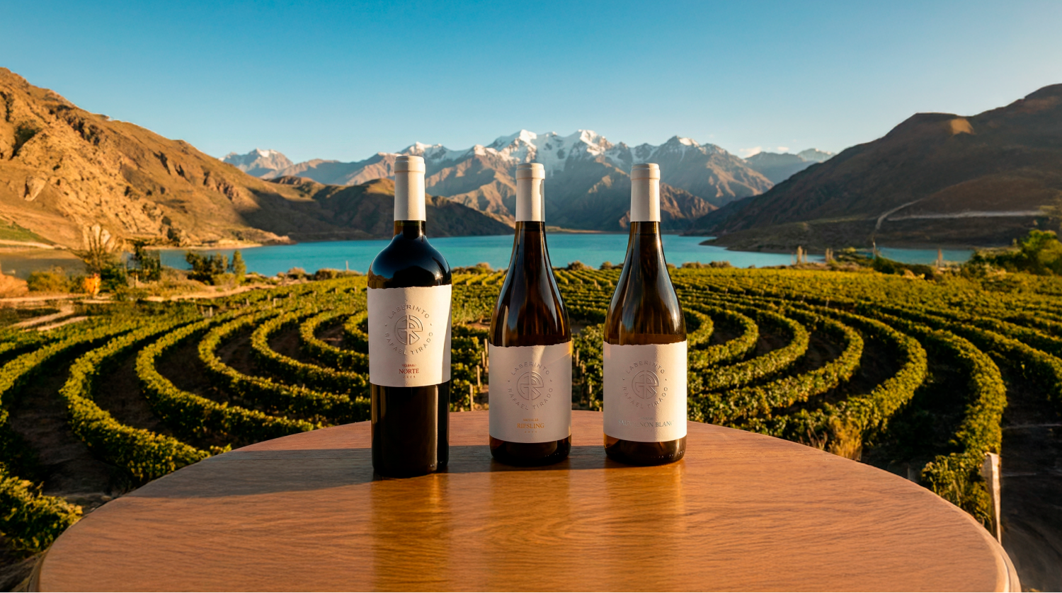
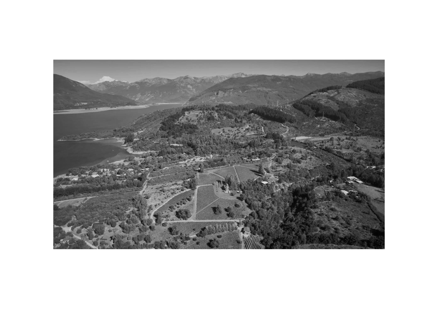
Laberinto is Rafael Tirado's Chilean winery, maker of Chile's best white wine, with a vineyard designed as a labyrinth on volcanic soils, on the shores of Lake Colbún, at the foot of the Andes.
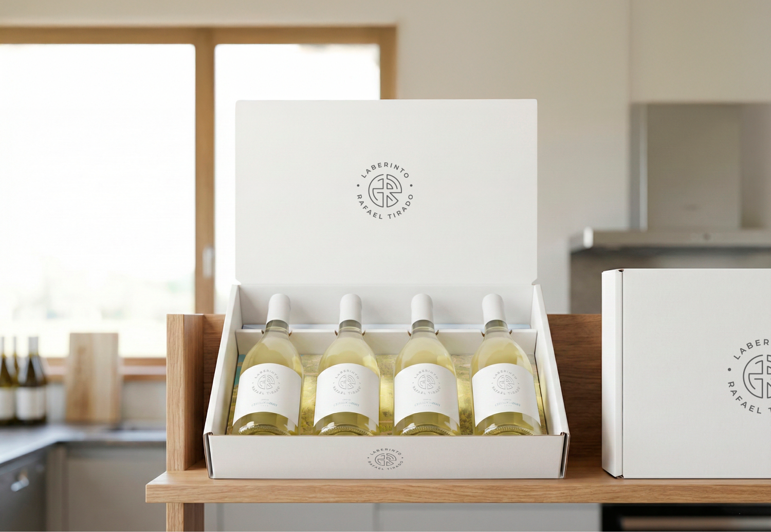
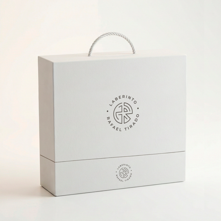
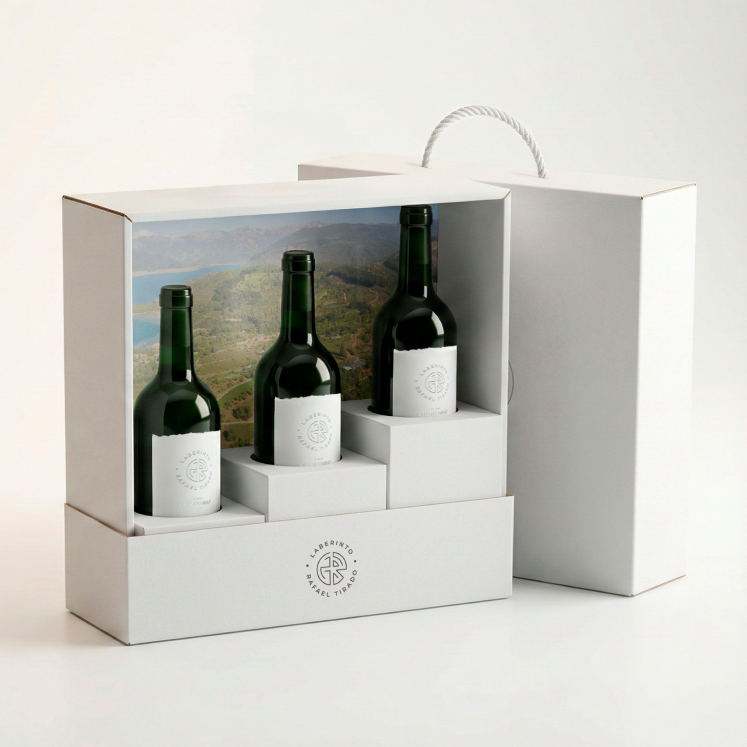
Invited by Oak and Arkler, we joined the project developing the brand strategy, brand design, labels and packaging. We also co-authored the sales presentation and social media.
The challenge
The challenge was to launch the brand in Brazil while drawing out a narrative worthy of the wine: clear for distributors, desirable for the market and true to its origin, because the previous communication conveyed neither its story nor the concept of its terroir.
What we solved · 01 / 10
Starting with the key application
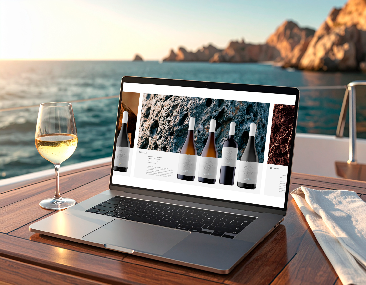
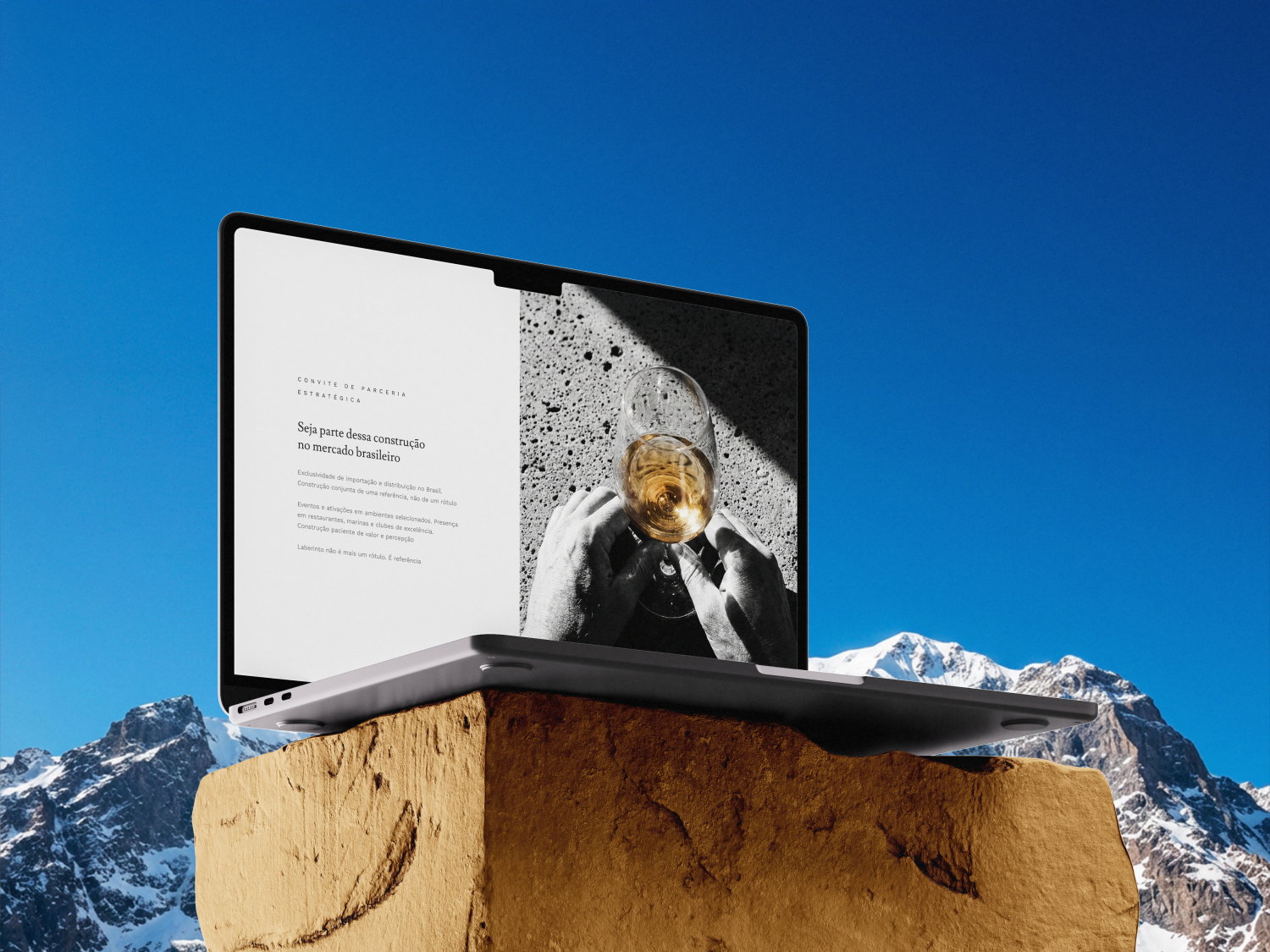
We needed to deliver sales material for distributors quickly, but already speaking a language worthy of the brand, so we started with the most critical application.
We developed the sales presentation following the new brand design from the start, raising sophistication and image alignment, and it became the practical foundation for the materials that followed.
02 / 10
An easier entry into Brazil
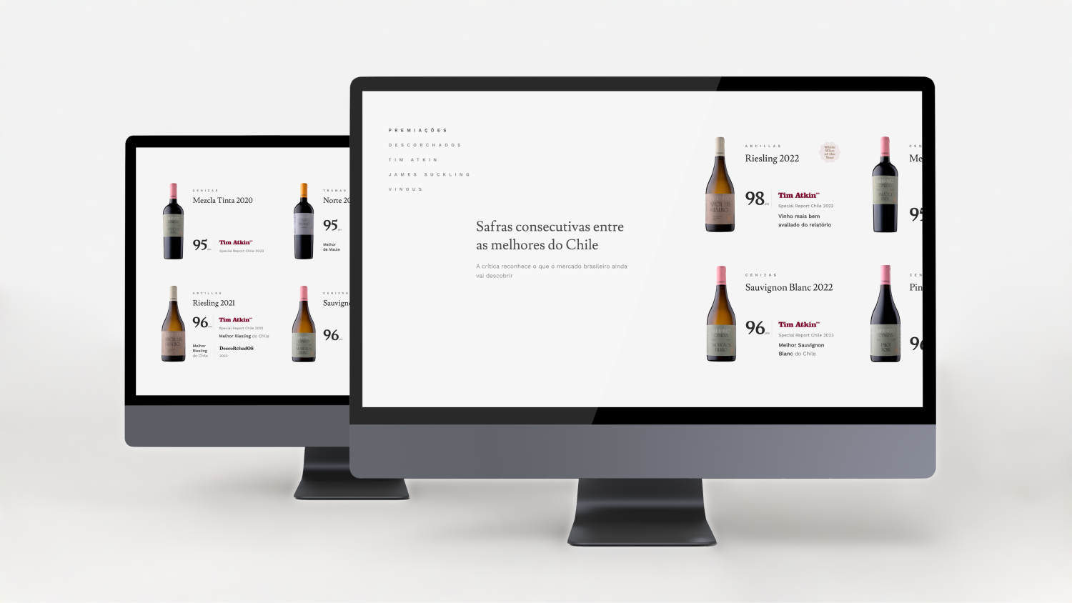
We needed Brazilian distributors and importers to understand Laberinto clearly, because the wine already had a reputation and differentiators; it just lacked a commercial translation.
We structured materials and guidance to communicate that truth, and the brand was ready for the Brazilian market.
03 / 10
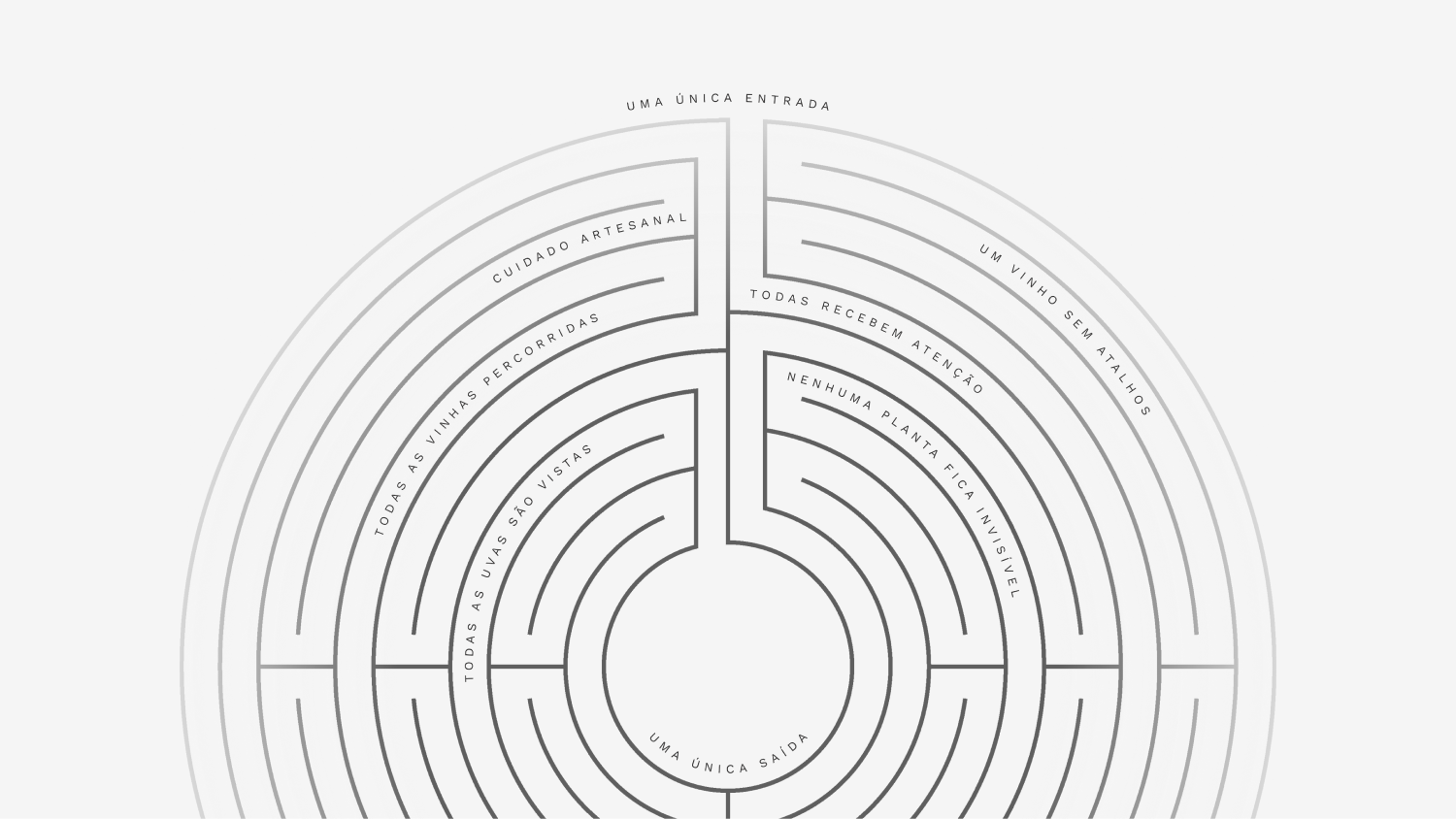
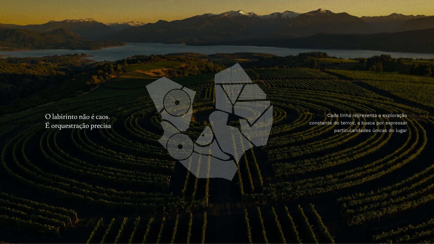
The labyrinth as a method of precision
We needed to show that the labyrinth was the vineyard and the process itself, with a single entrance and a single exit that allow full, hands-on monitoring, not a conceptual metaphor.
By bringing this to the center of the messaging and identity, the concept became a clear signature of precision and extreme control.
04 / 10
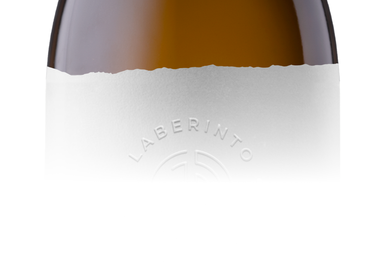
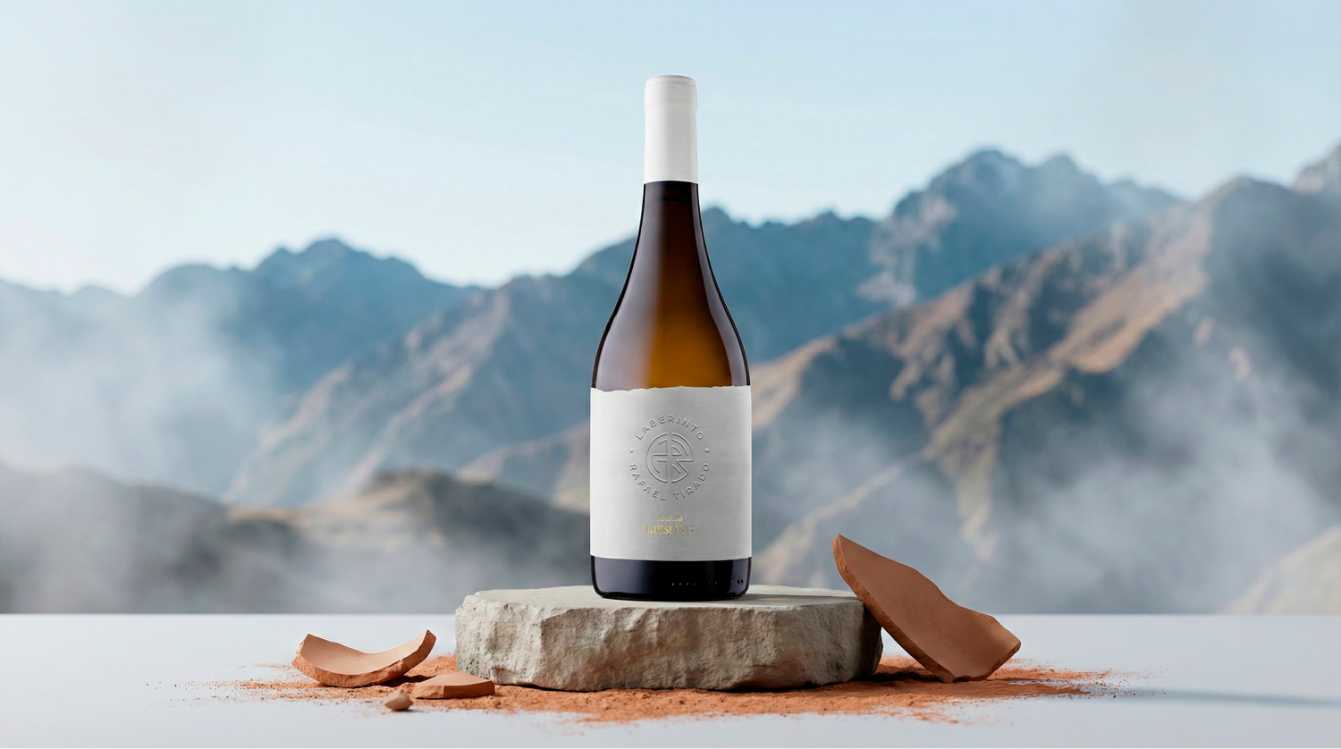
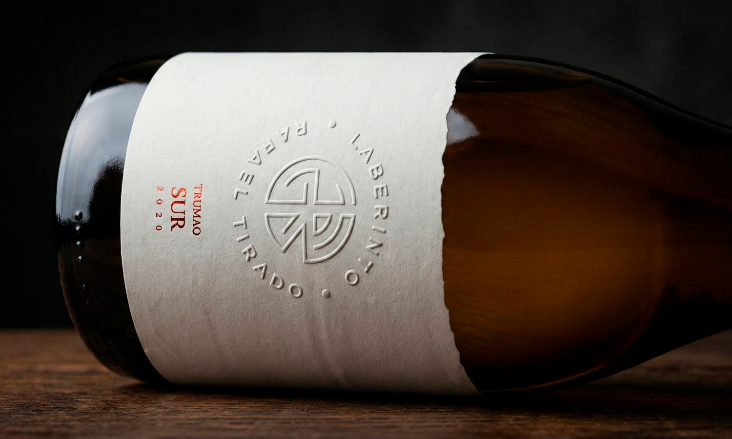
The Andes and Lake Colbún on the label
We needed a simple gesture to anchor the origin.
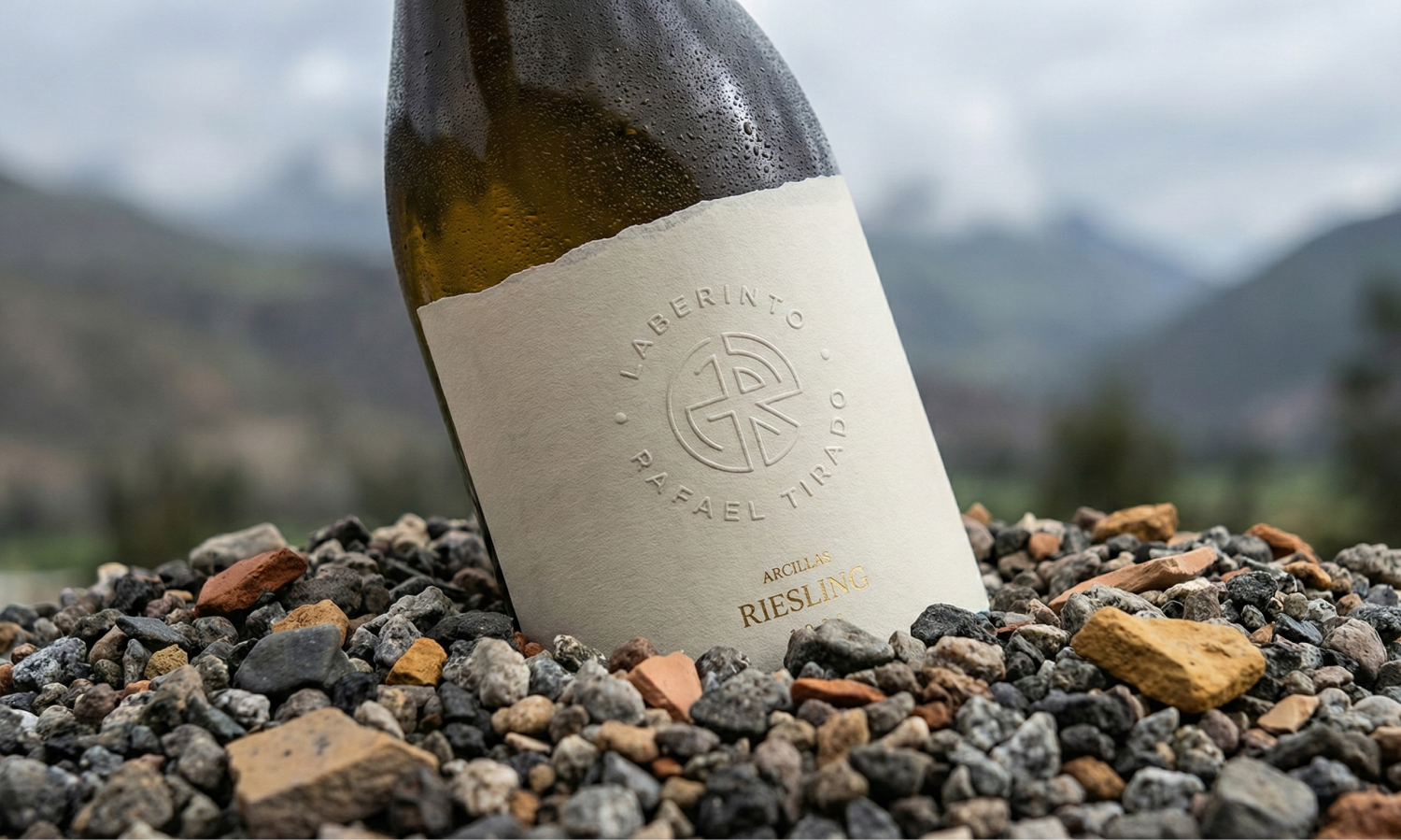
We added the Andean silhouette as the top cut, which also evokes the waves of the lake, and the label gained a subtle yet strong detail.
05 / 10
A label that puts the origin in your hands
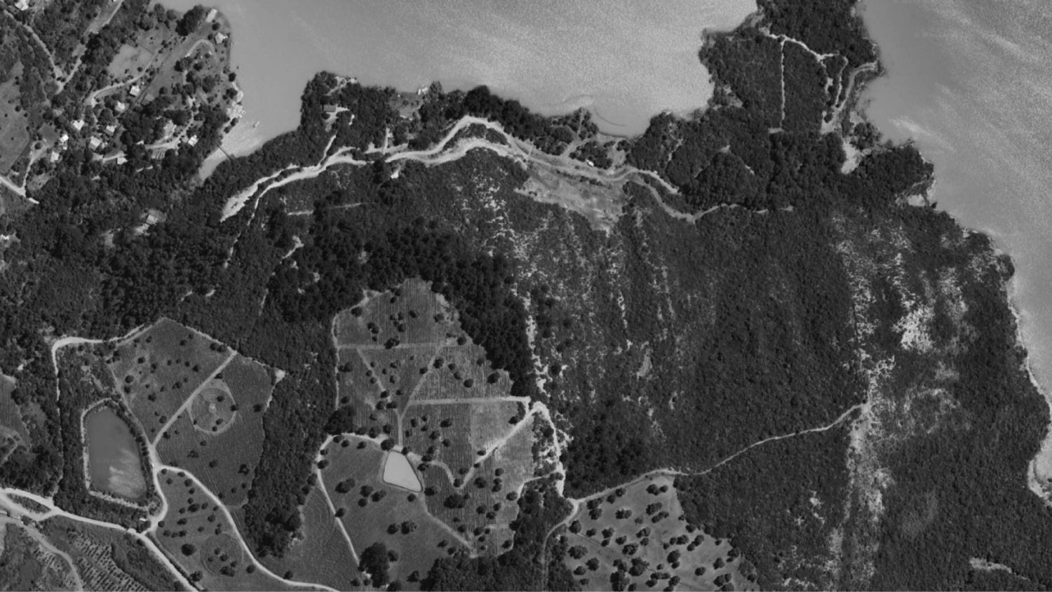
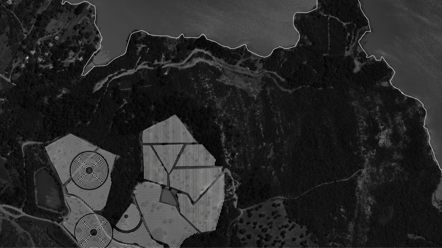
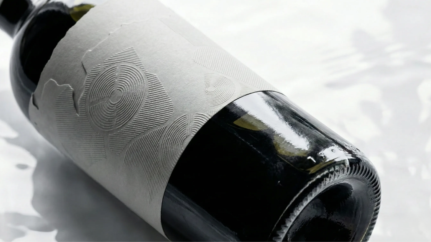
We needed the bottle to tell what was already in the land: the vineyard's terrain, the lake, the depth of the landscape.
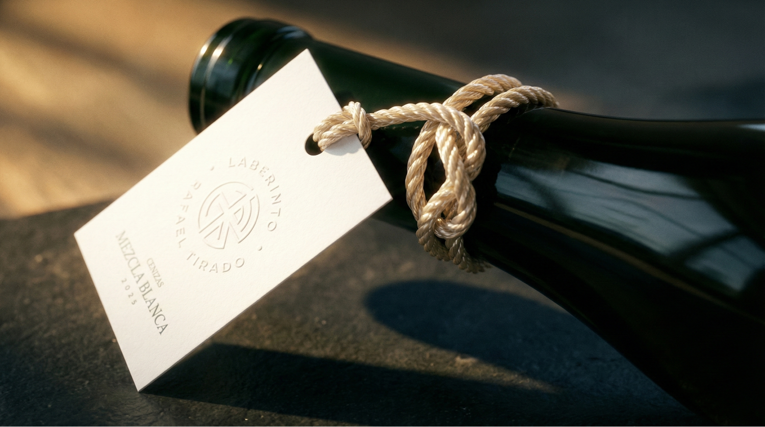
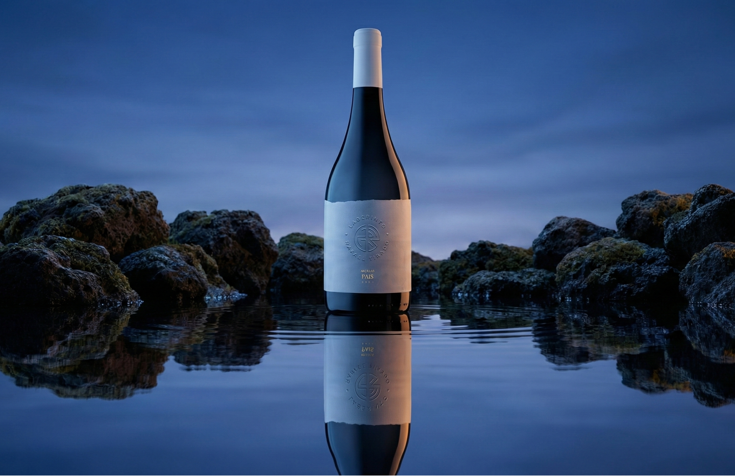
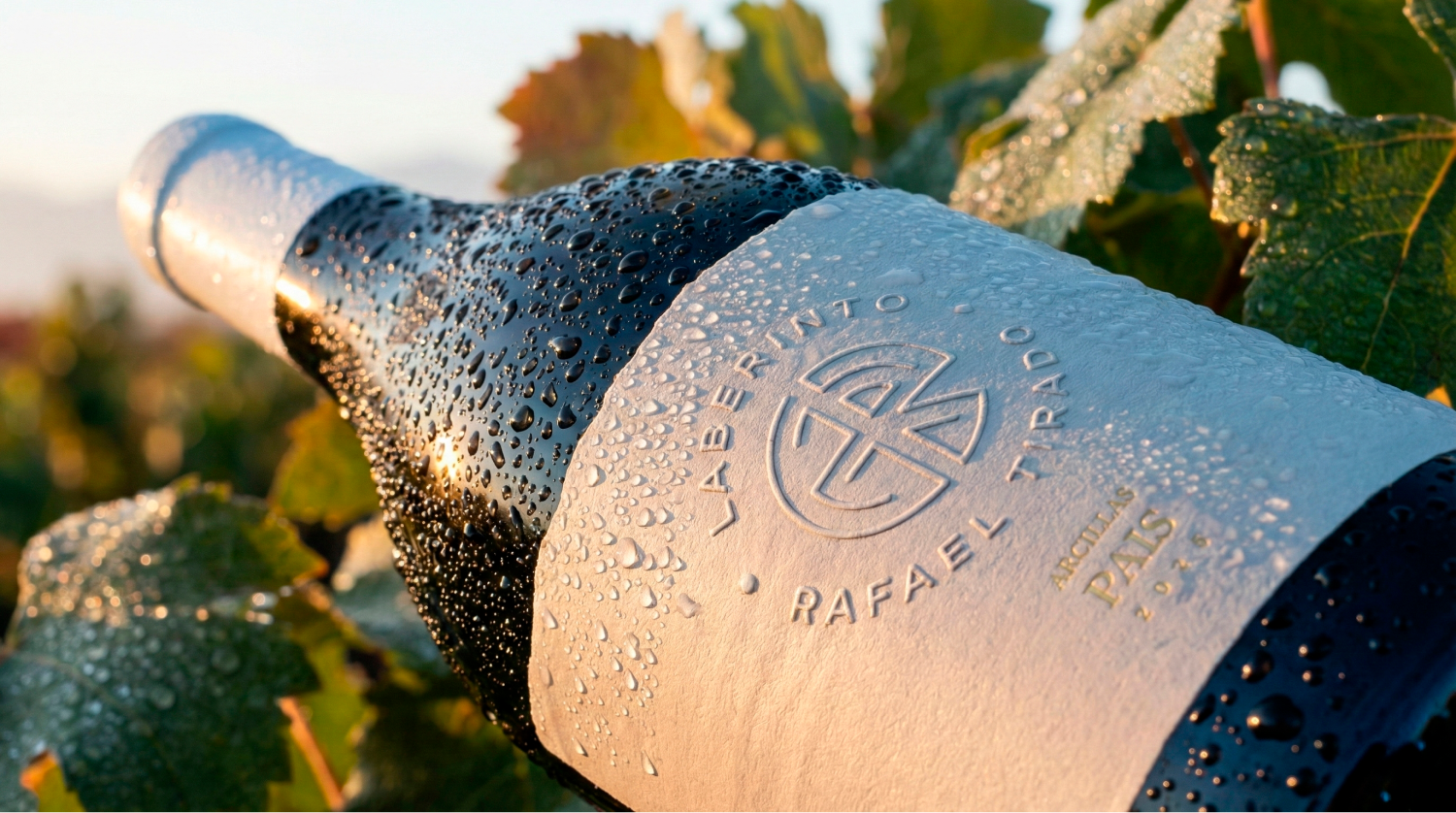
We translated this geography onto the label with embossing and debossing, true-to-life planting lines and intentional adjustments that stay faithful to reality, and the product began to deliver its origin in a sensory way.
06 / 10
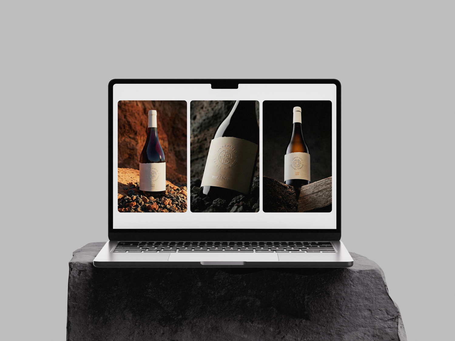
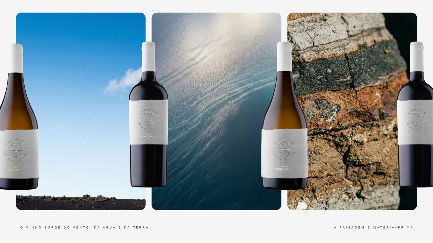
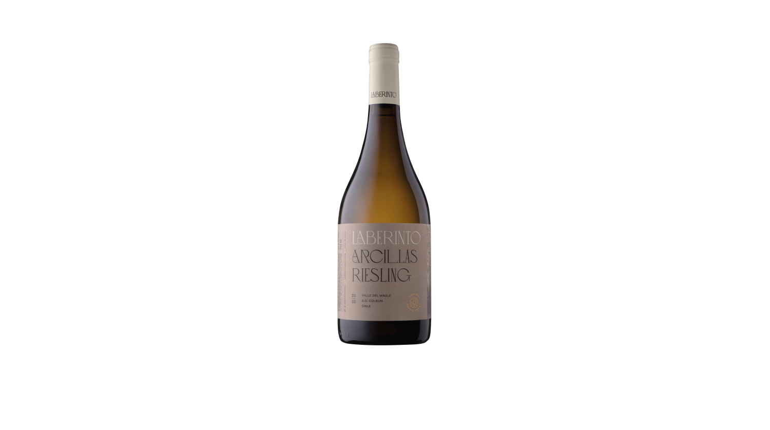
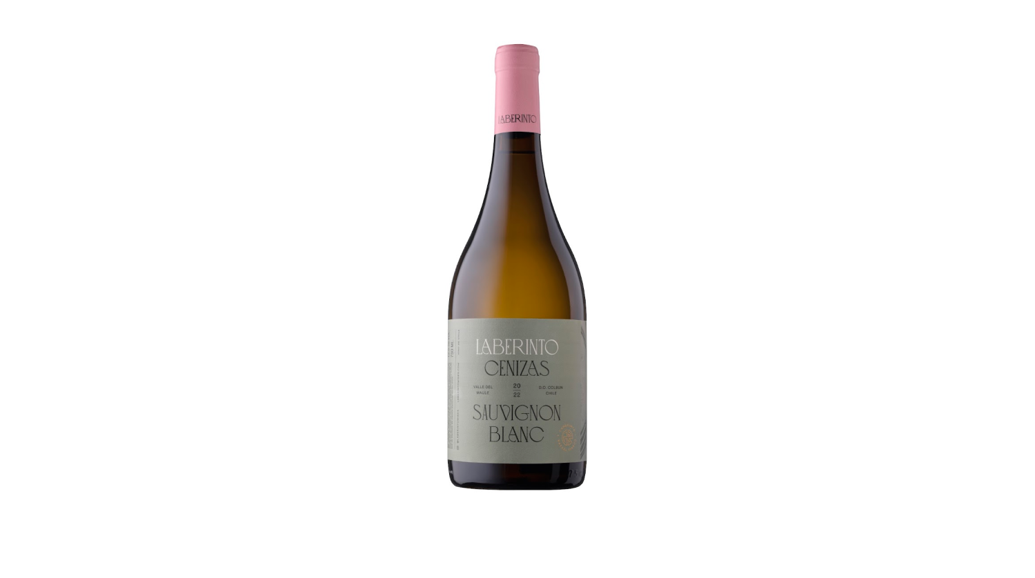
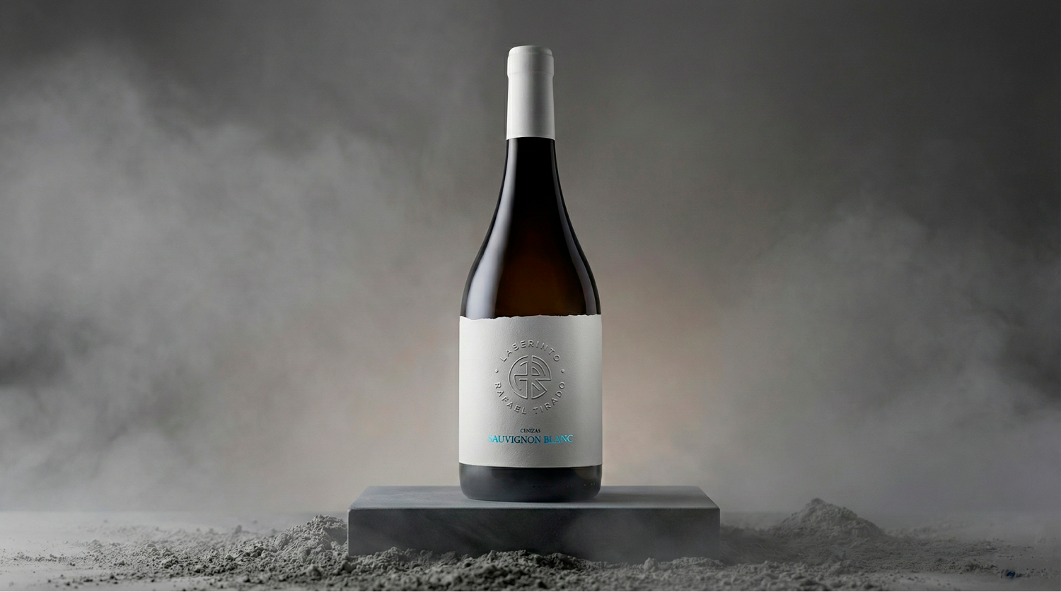
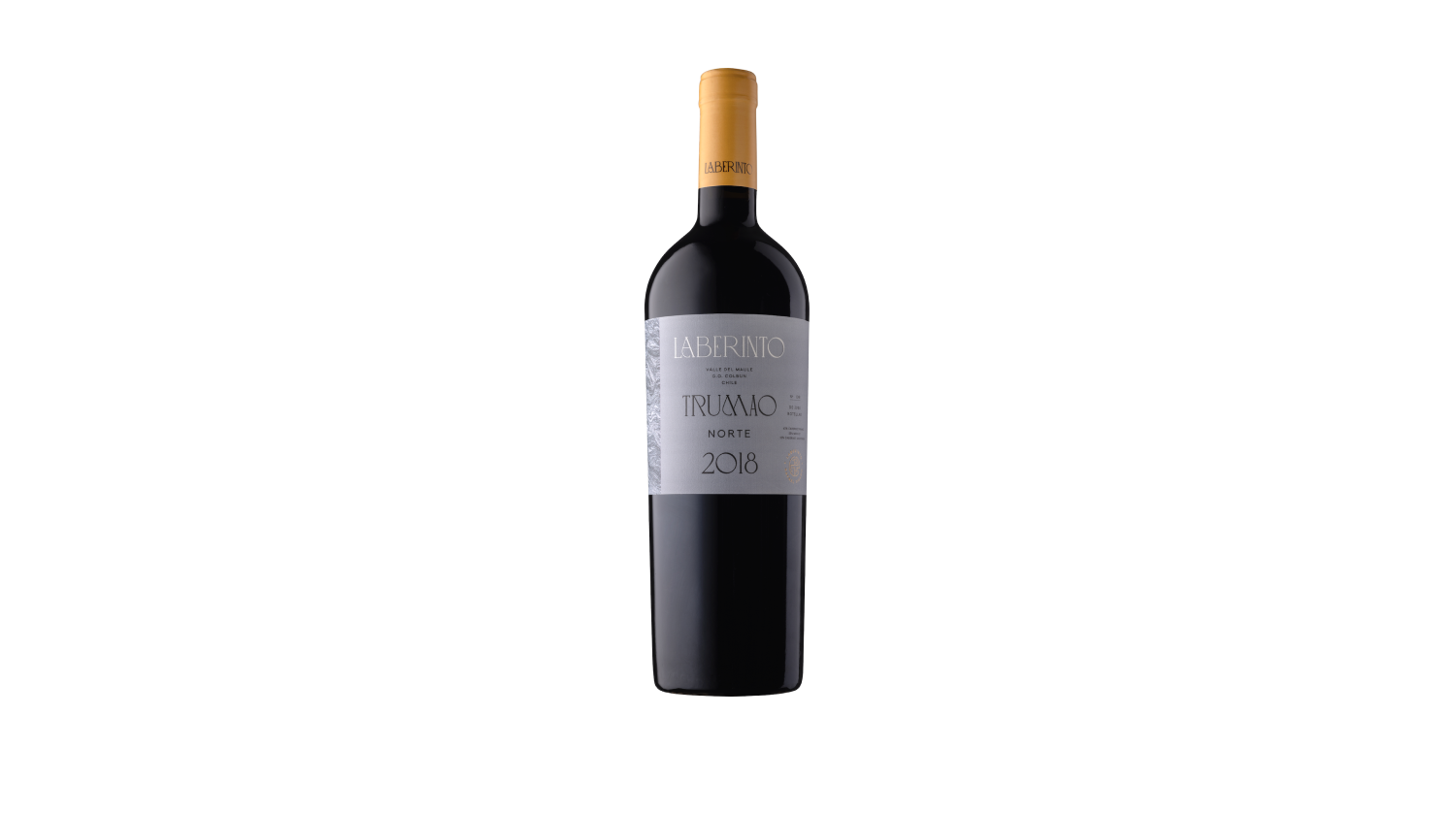
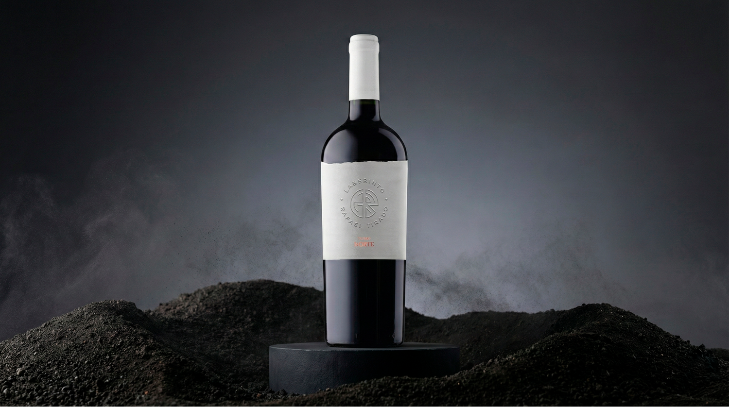
A clear, sophisticated portfolio
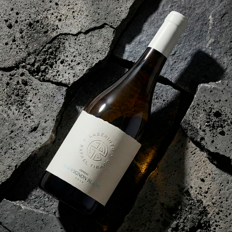
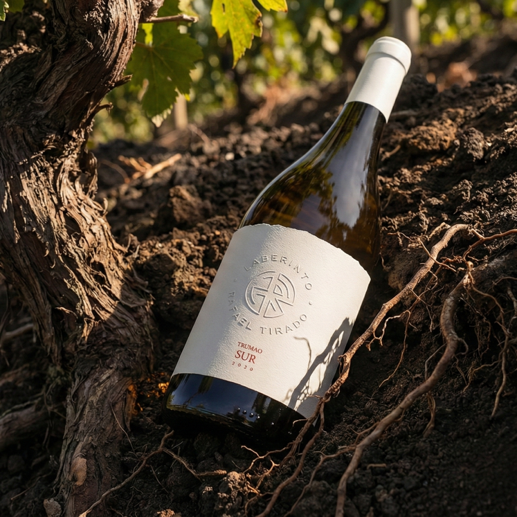
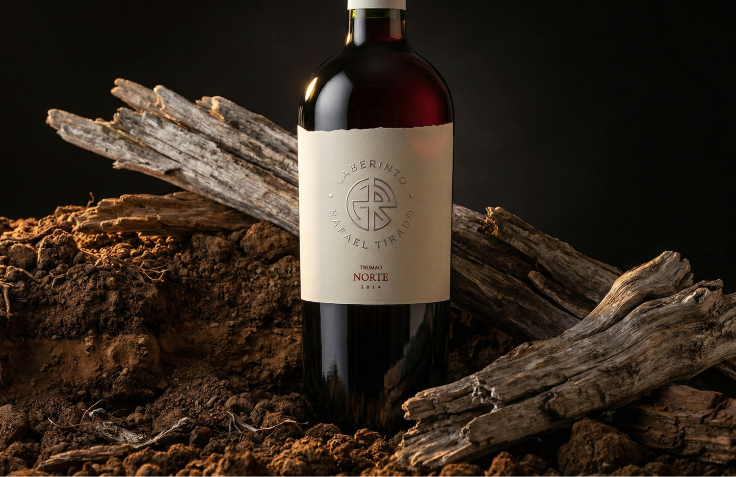
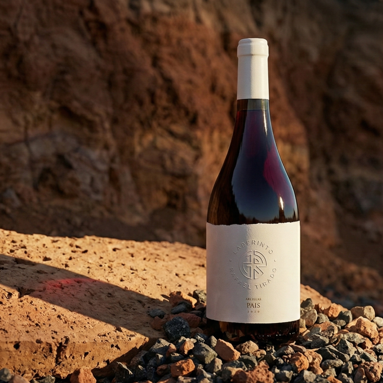
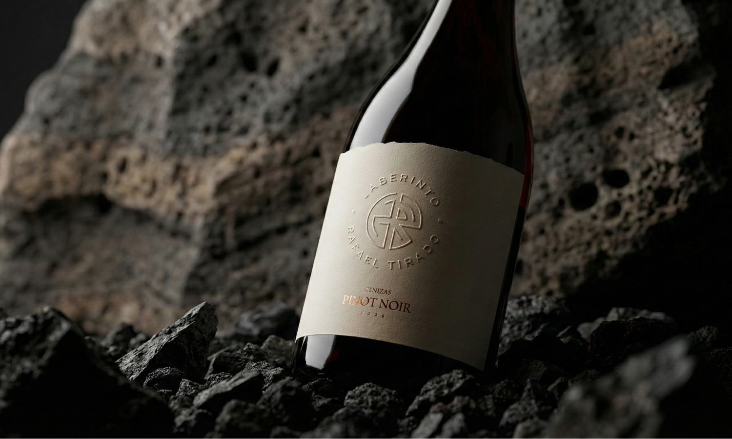
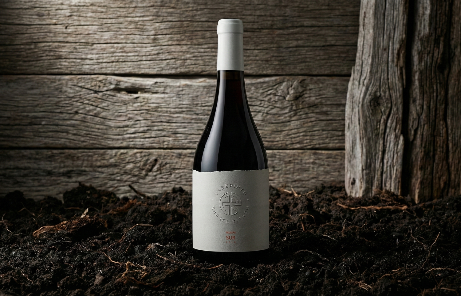
We needed to differentiate the Cenizas, Trumao and Arcillas wine lines, letting each one speak in its own voice.
We anchored finishes and colors in the real geology in a minimalist way, and the portfolio gained uniqueness and meaningful sophistication.
07 / 10
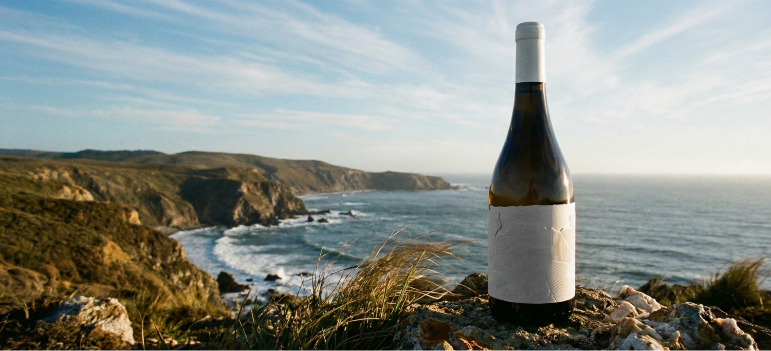
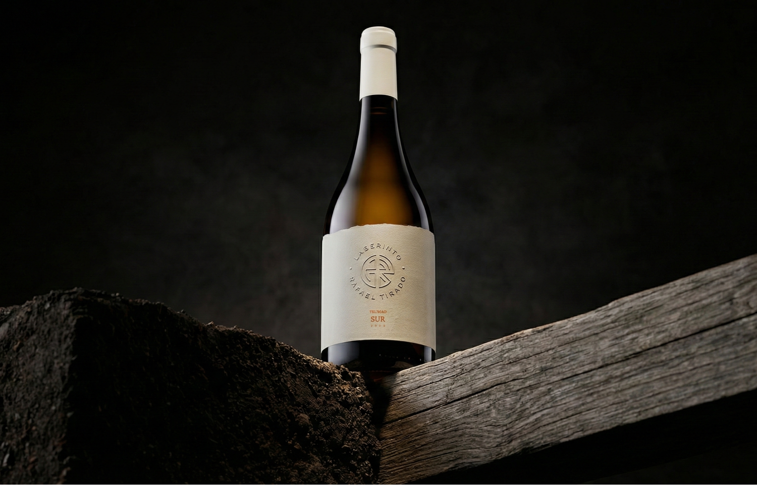
Communicating freshness and minerality
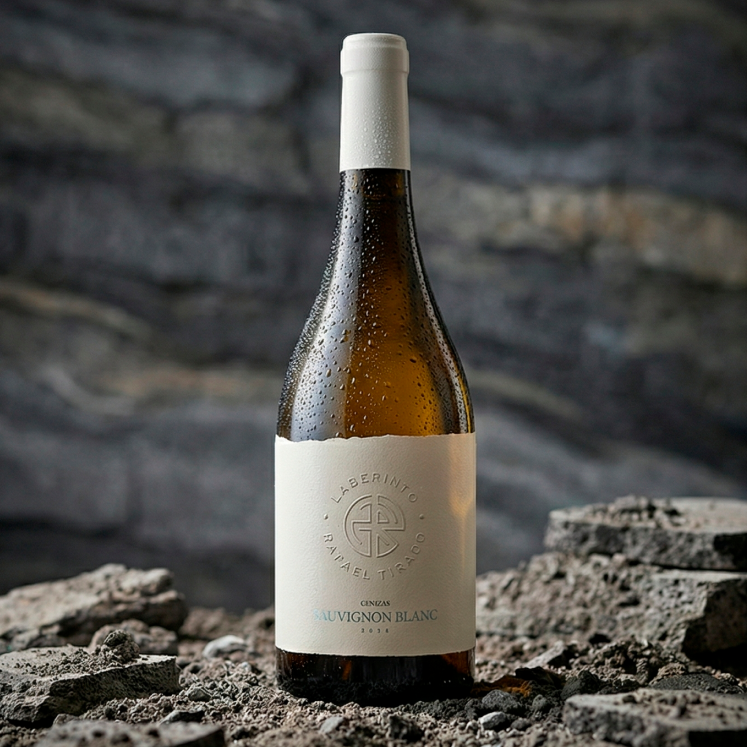
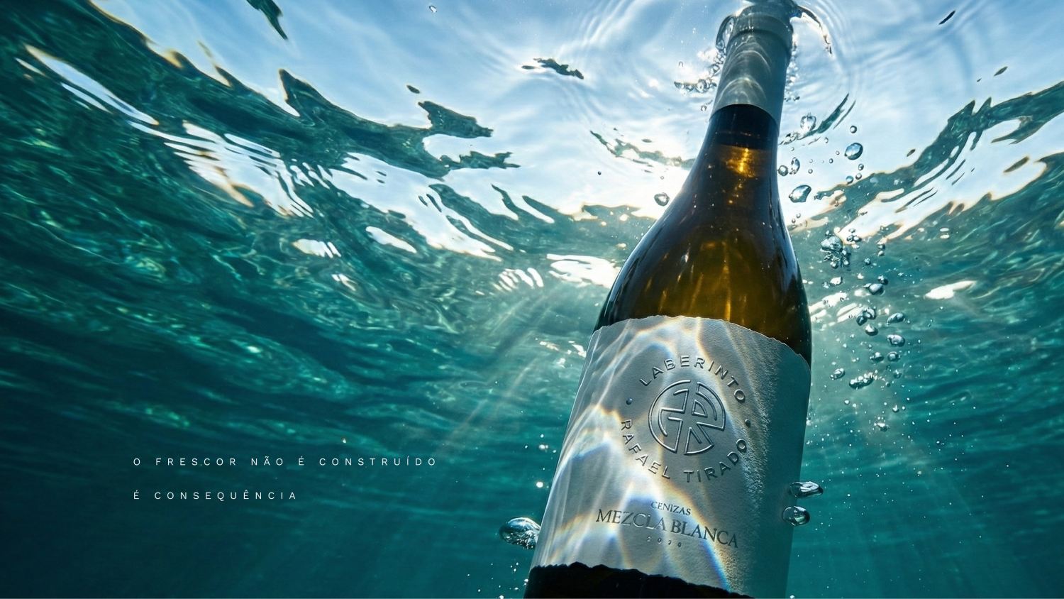
We needed to visually anticipate the freshness and minerality the wine delivers, even before the first sip.
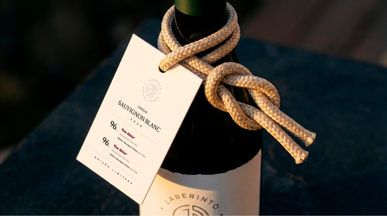
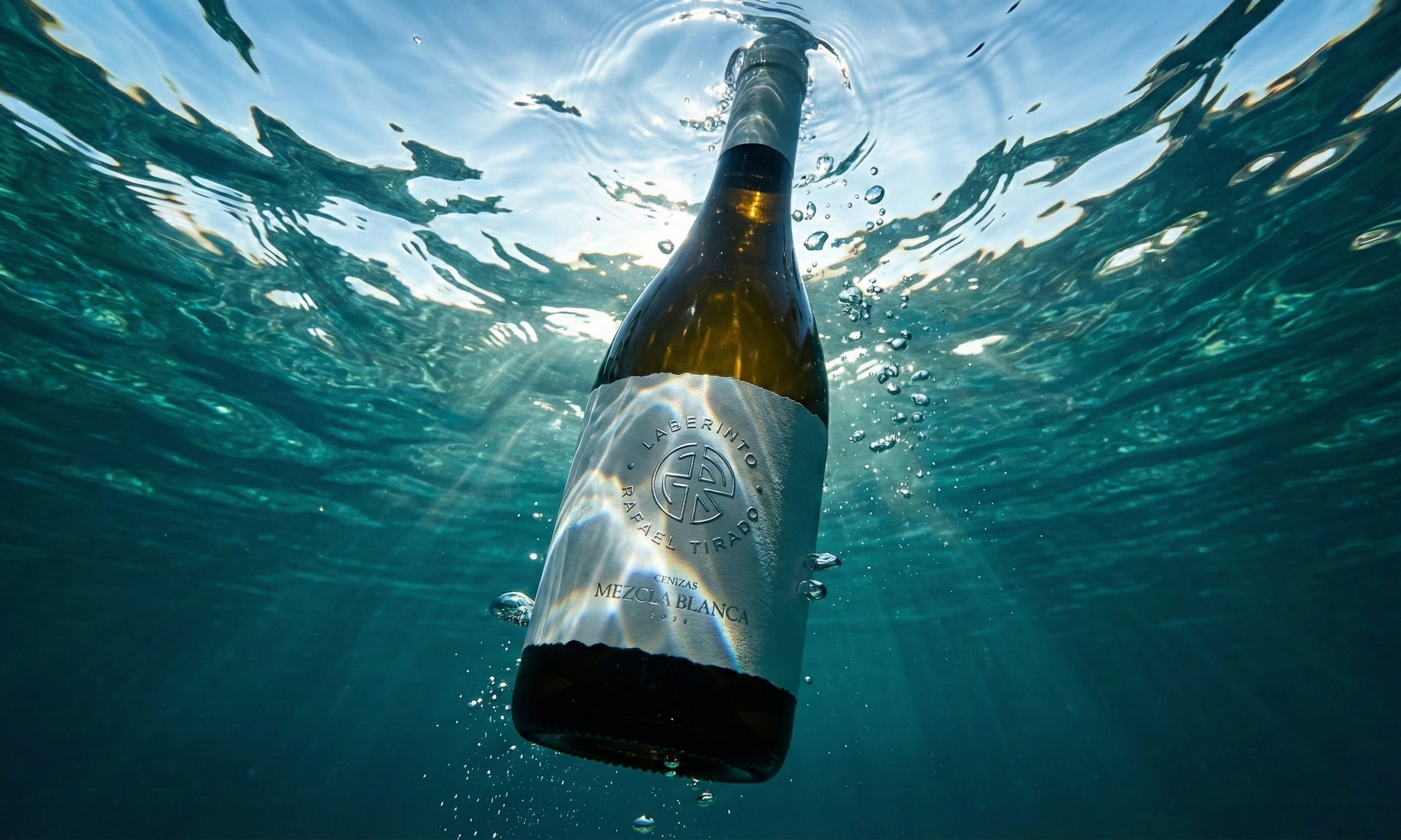
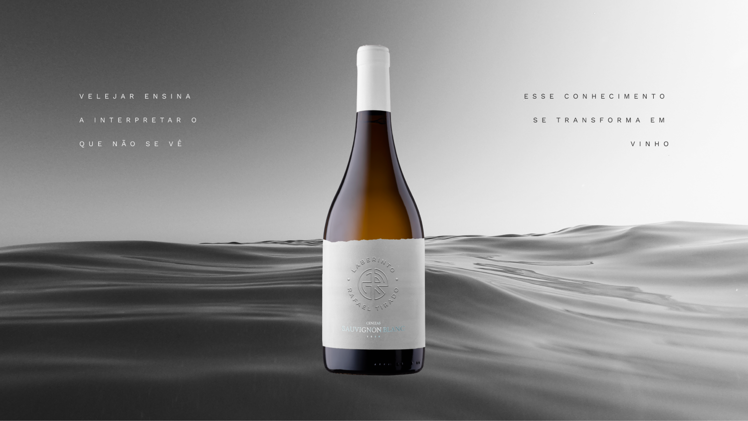
We translated this into the imagery and photography guidelines, with references to the nautical world, like water, condensation and dew, and textures that evoke the volcanic soil and the minerality of the terroir.
08 / 10
Keeping the logo, strategically
We needed to evolve how Laberinto was perceived without touching the logo, because it wasn't the right time and there was no real need for a change.
We kept the logo and integrated it naturally into the new brand design, ensuring continuity while raising sophistication.
09 / 10
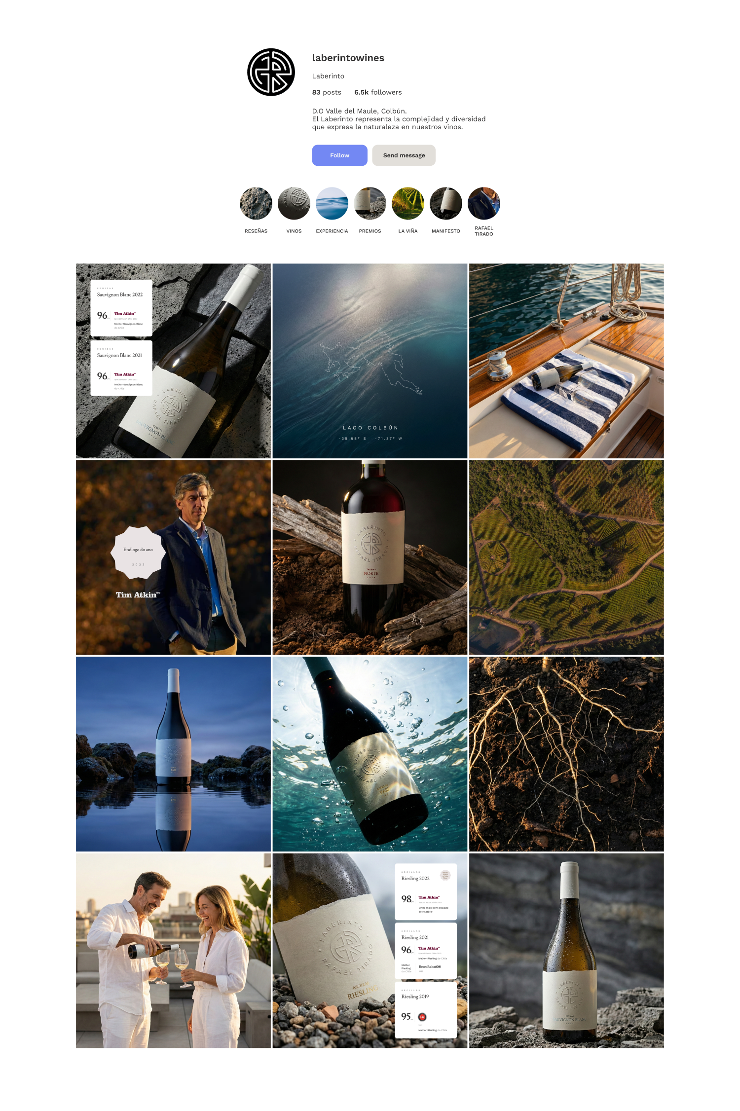
An authentic narrative
We needed to show the story that was already there; it just wasn't coming through in the communication.
We revealed and organized the real origin, with the discovery of the terroir at Lake Colbún, at the foot of the Andes, and the founder as the lens, a sailor who reads the vineyard the way he reads wind and currents, and the brand finally gained a true narrative.
10 / 10
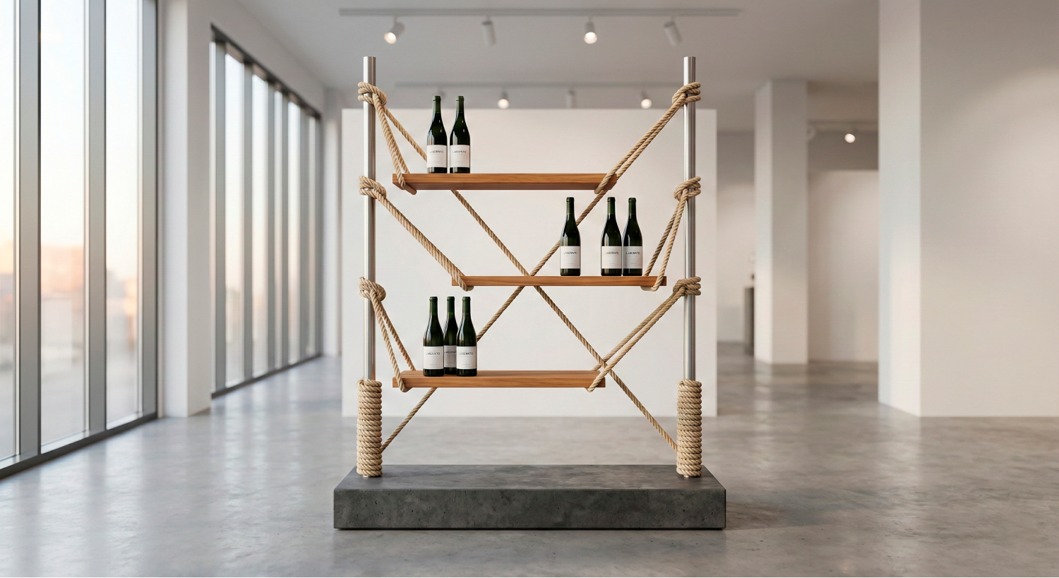
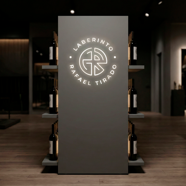
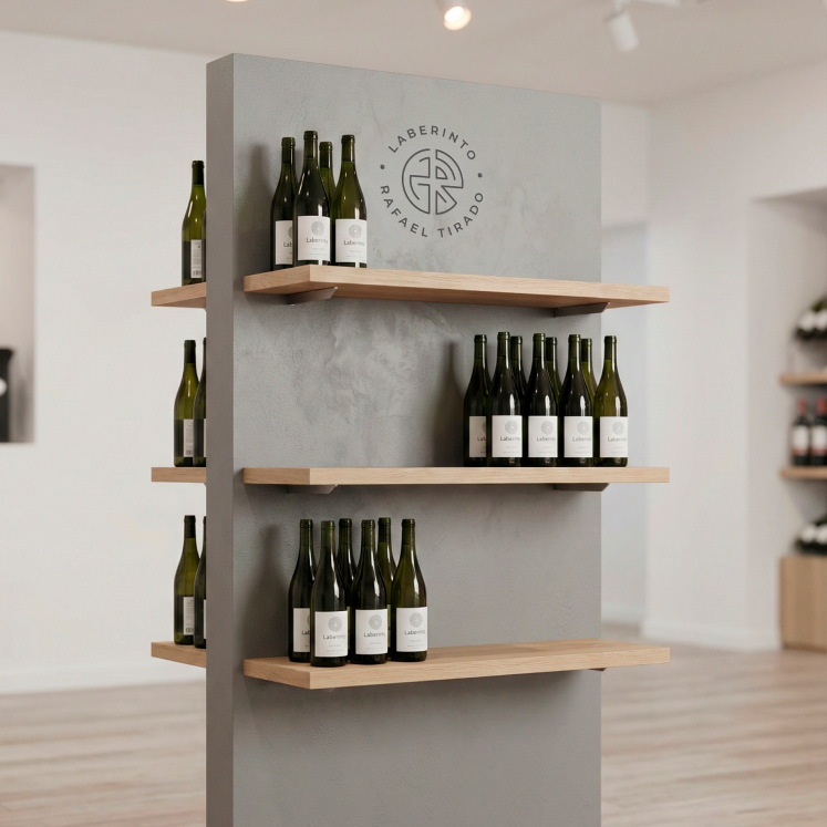
Point of sale and packaging
We needed the experience not to end at the bottle.
We defined direction for packaging and POS, and the brand began to present itself consistently in any sales context.