0107
ARTICO , Refrigeration Industry
Project
Revealing and renewing the legacy was the way to raise its value
- SERVICES
- Brand strategy
Brand design
Catalogs - CLIENT
- ARTICO
- SECTOR
- Refrigeration Industry
- PARTNERS
- Maiara Kososki Brand Marketing

The client
ARTICO is a pioneering commercial refrigeration manufacturer with more than 60 years of history. They develop and manufacture solutions for preserving and displaying food and beverages, combining robust engineering, efficiency and responsible innovation.
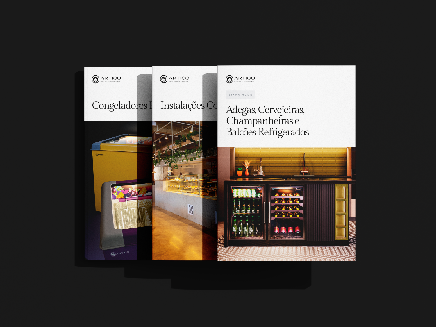
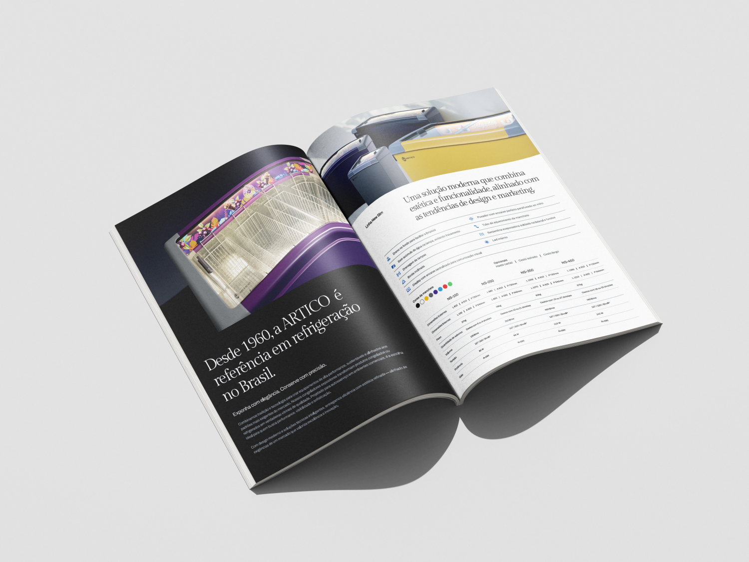
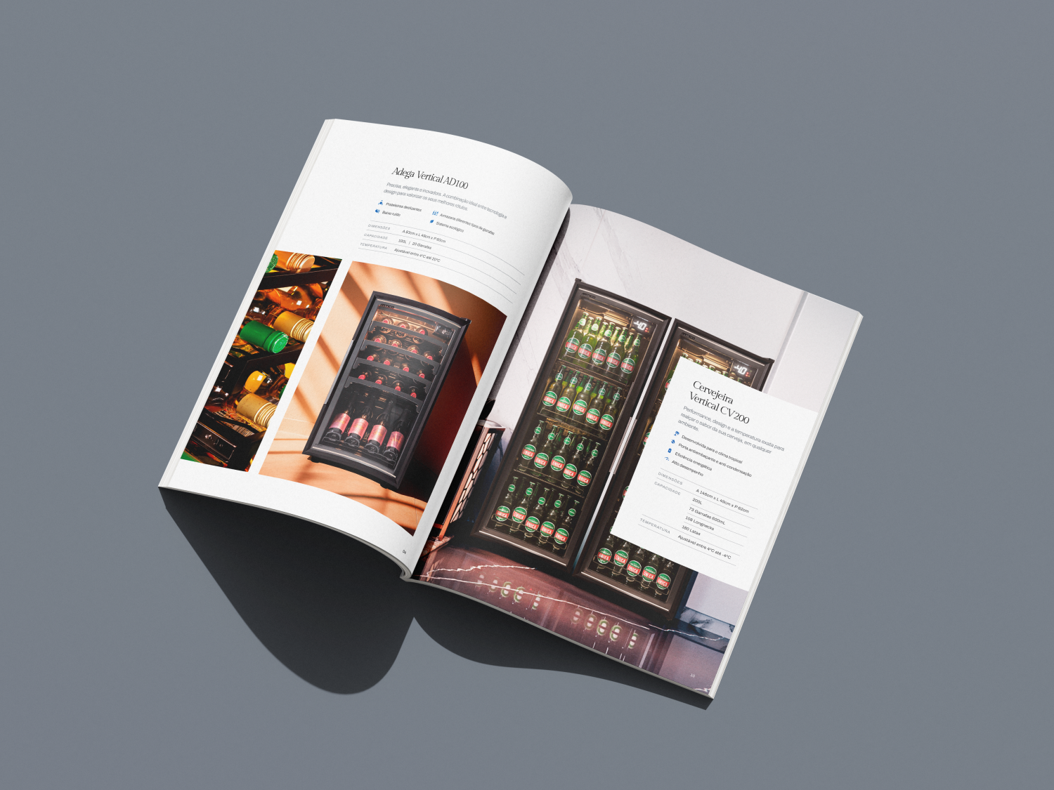
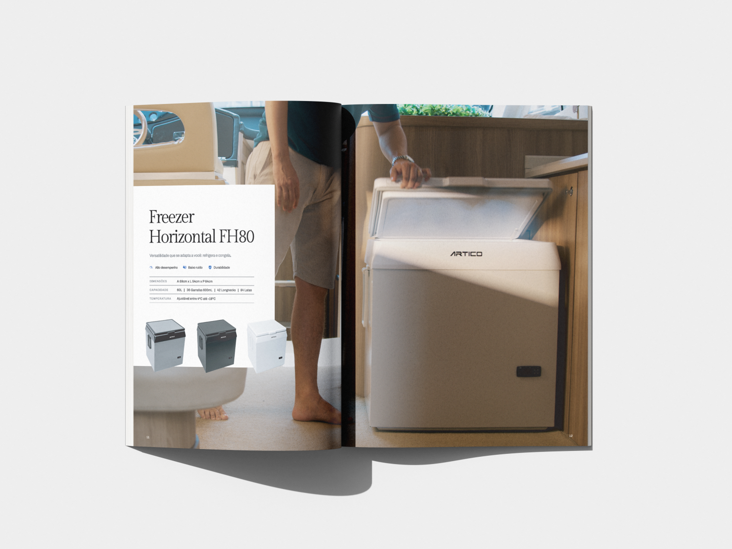
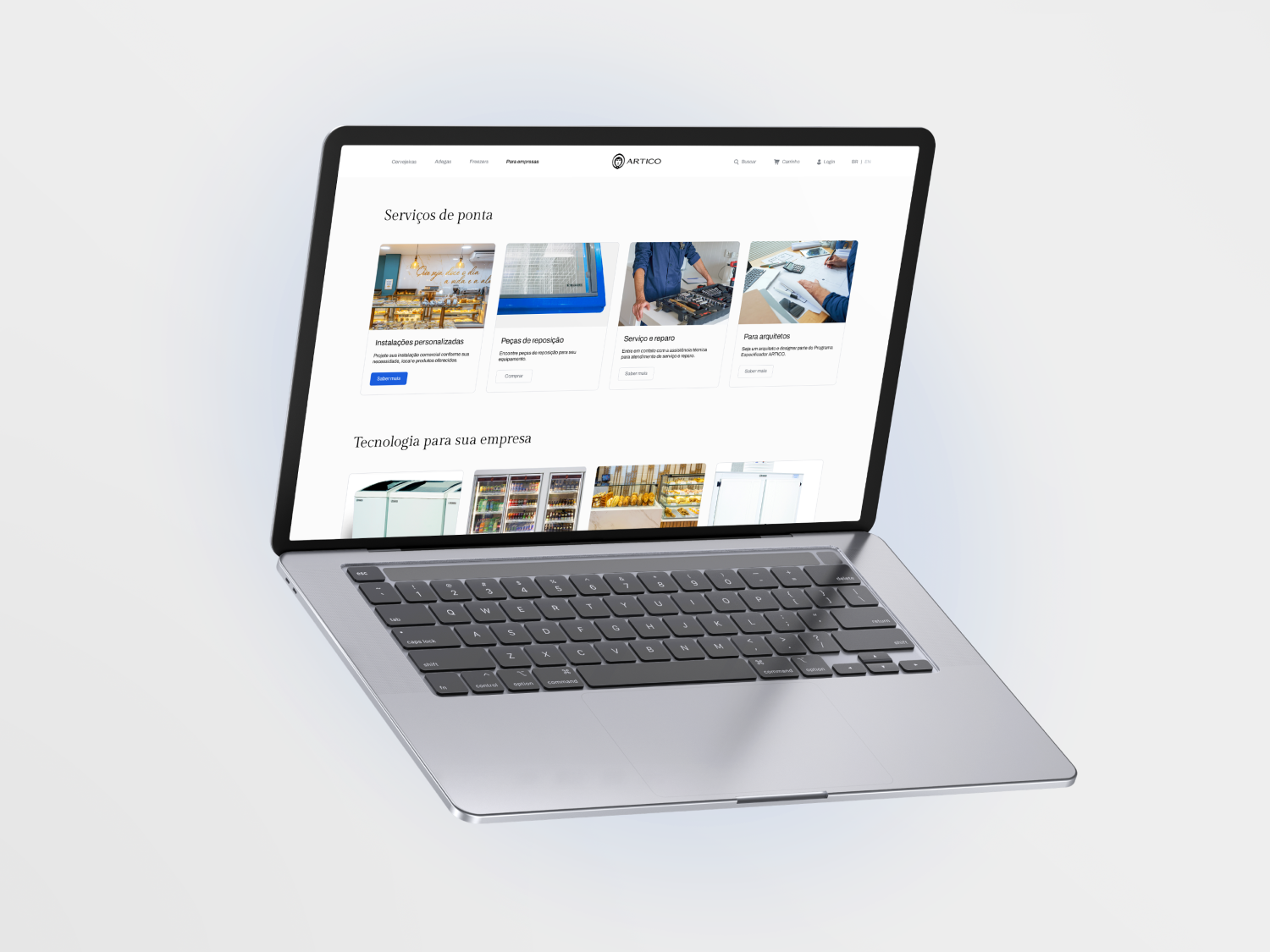
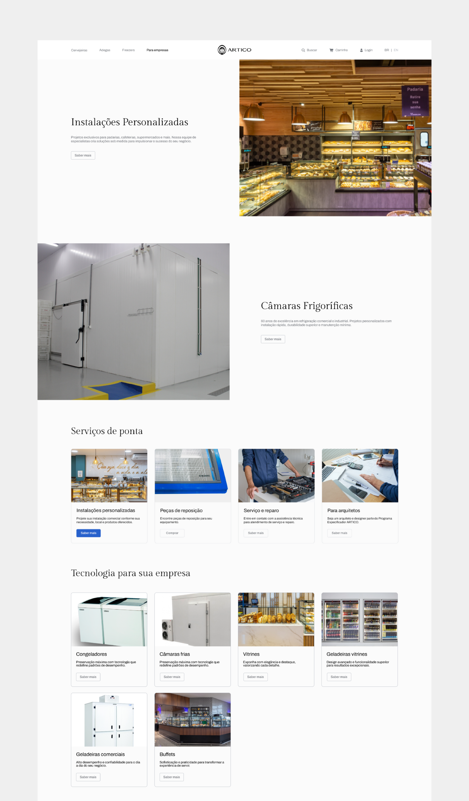
Invited by Maiara Kososki, we joined the project co-authoring the brand strategy, while the brand design was led and developed by us. Later, working directly with ARTICO, we developed the catalogs.

The challenge
The challenge was to reposition the ARTICO brand in the consumer market to increase sales of high-value-added products, strengthen the brand identity and compete head-on with well-known brands.
What we solved · 01 / 06
Evolving the legacy without losing recognition
ARTICO needed to update its historic identity without abandoning its strongest assets: the Eskimo and the color blue.
We redesigned the brand, keeping the icons while raising authority and sophistication.
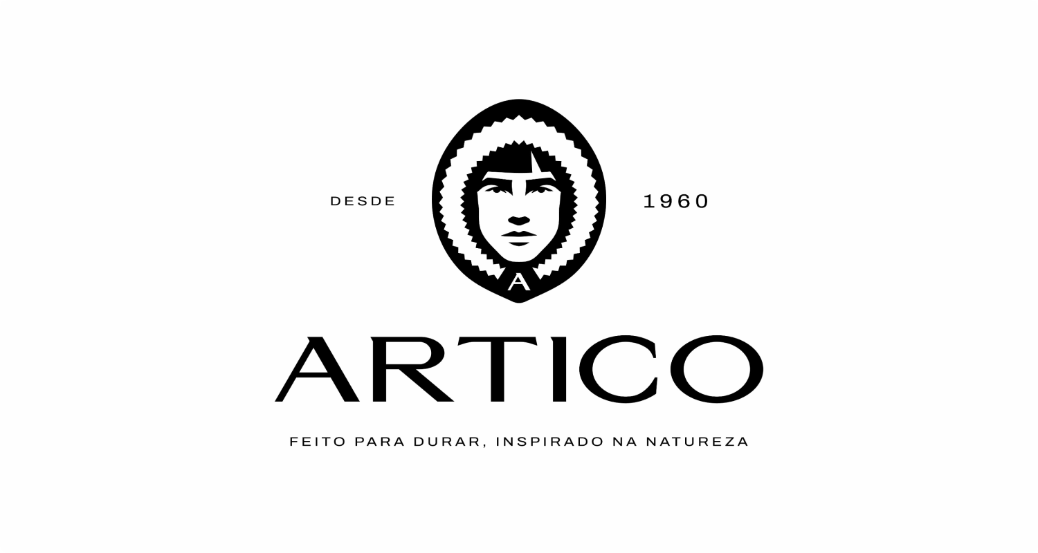 After
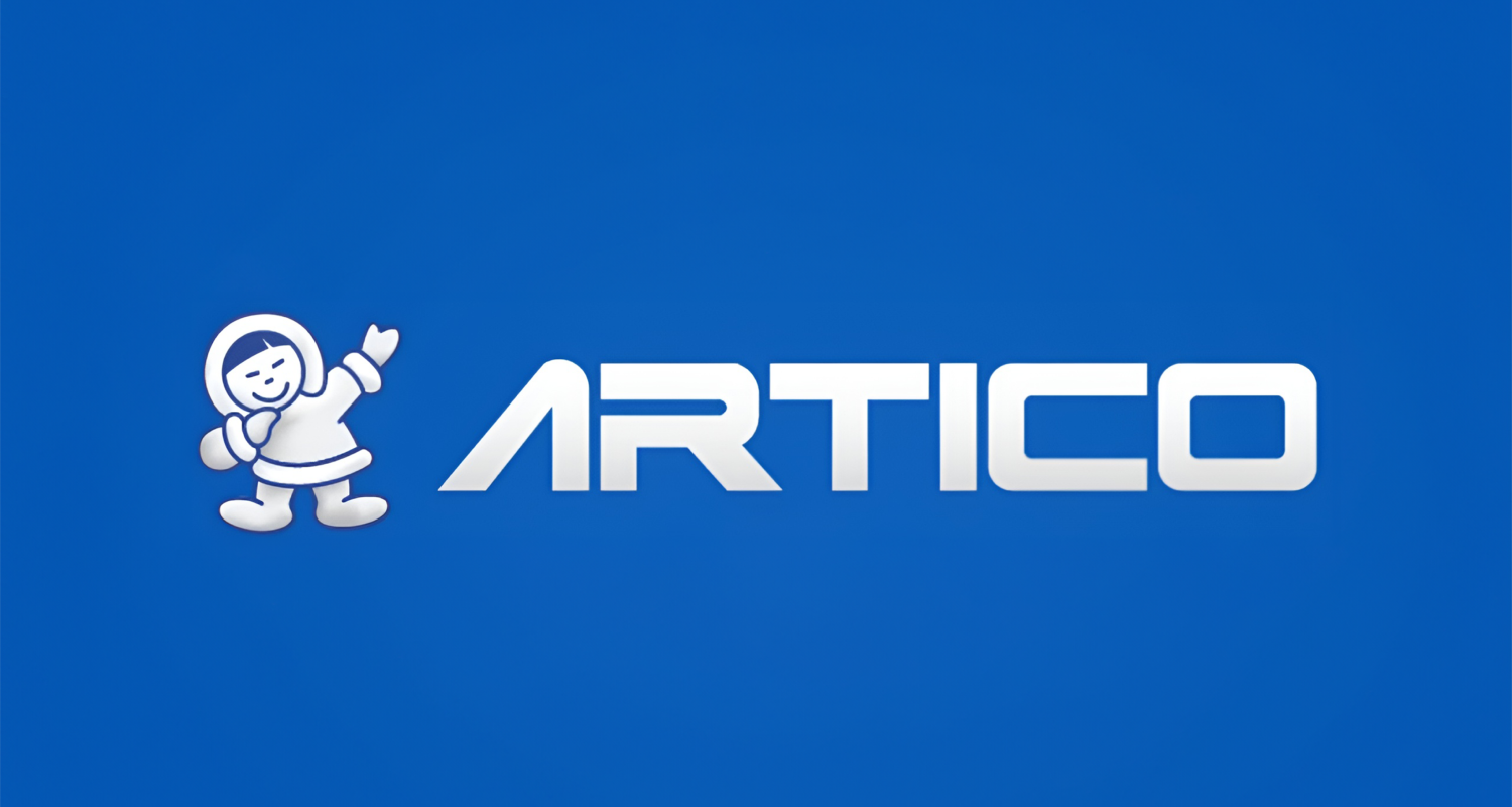 Before
02 / 06
Repositioning for high value
ARTICO needed to raise how it was perceived to sell more high-value products and compete with well-known brands.
We restructured the positioning and narrative to support a more premium, trustworthy presence.
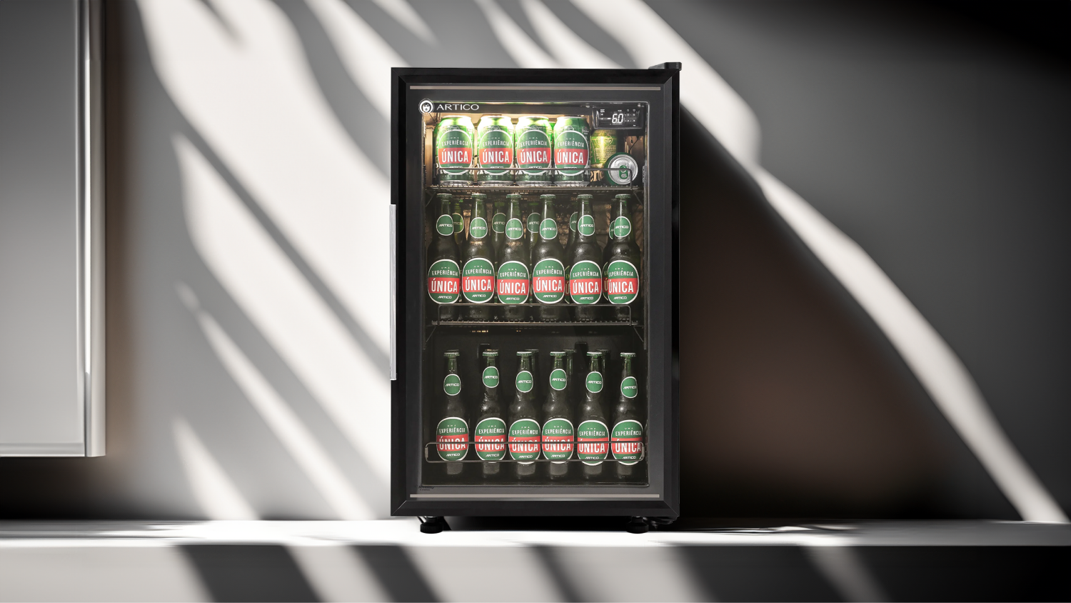
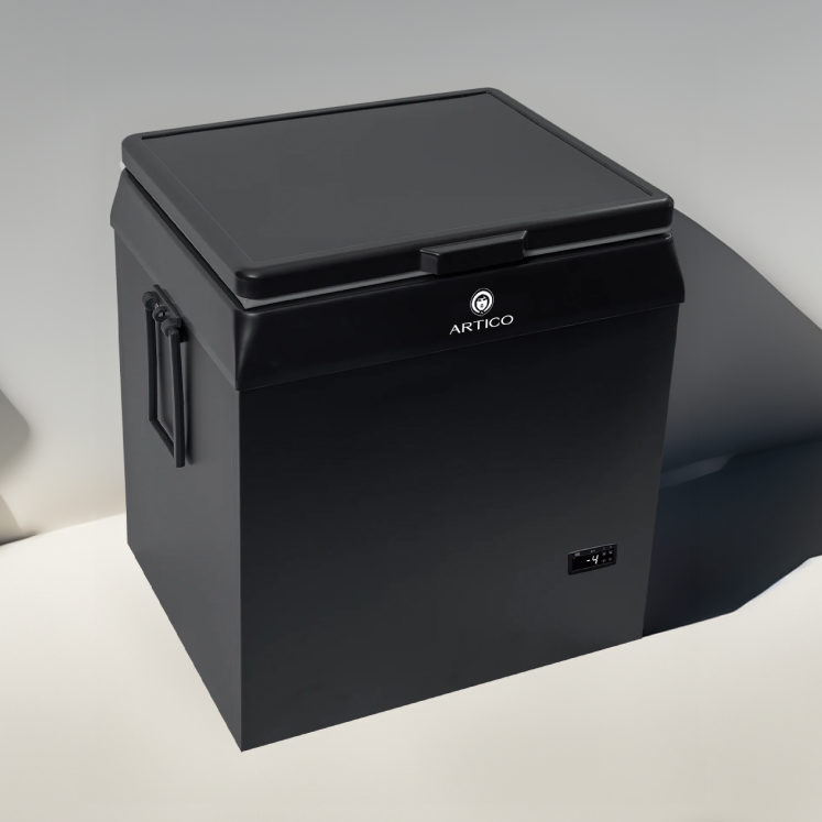
Design decisions
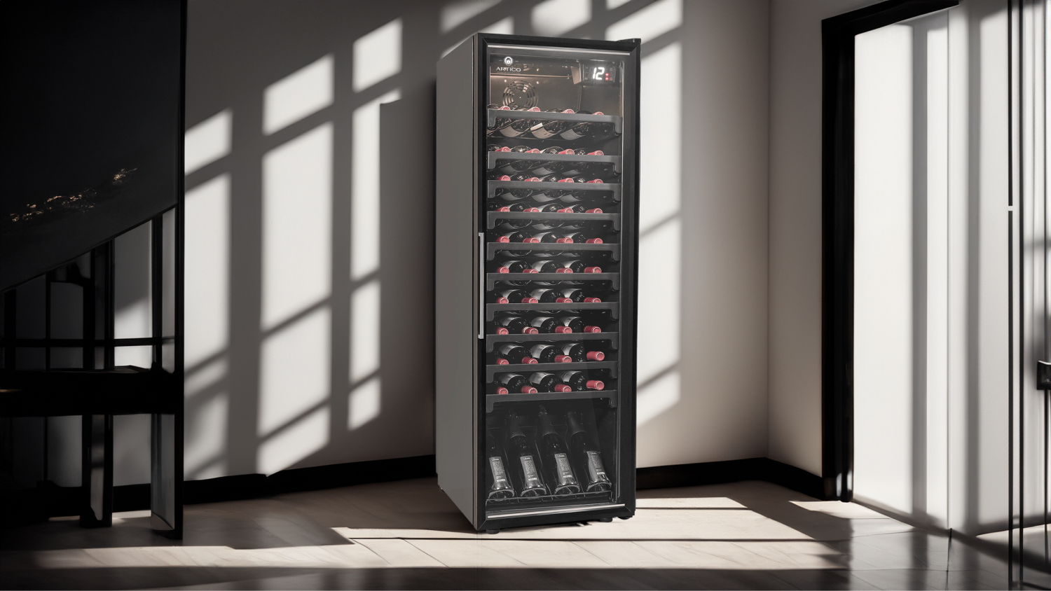
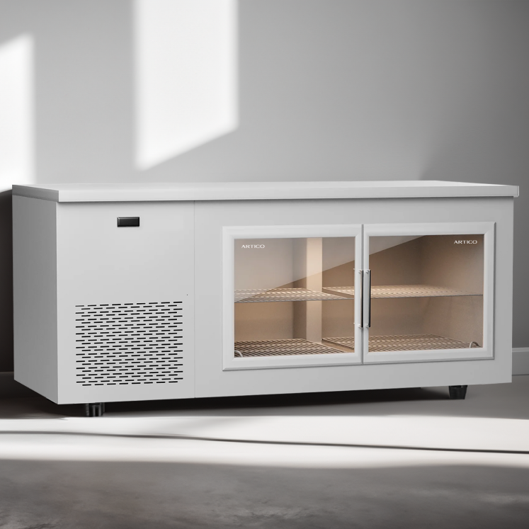
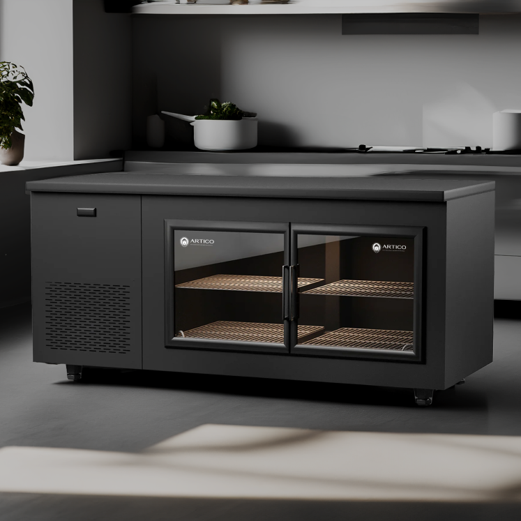
Product focus
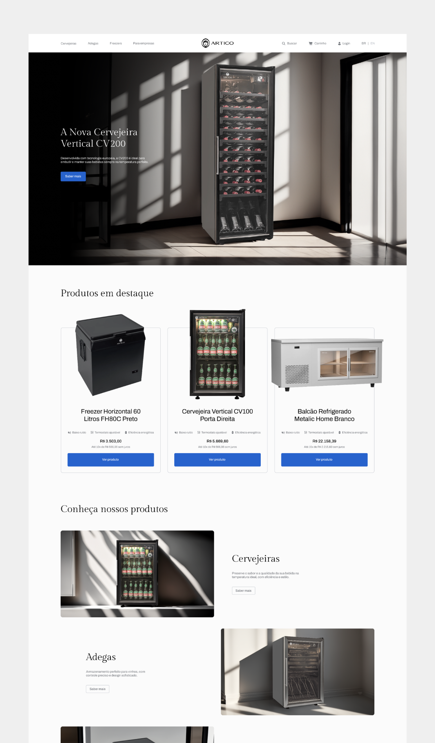
The perception of value had to come from what ARTICO delivers: robustness, precision and technology.
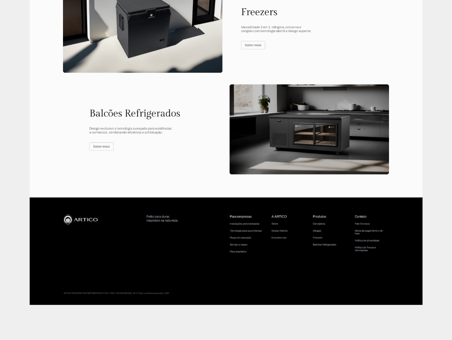
We steered the imagery and composition toward product focus, light and contrast, reducing distractions and elevating the experience.


Materiality and texture
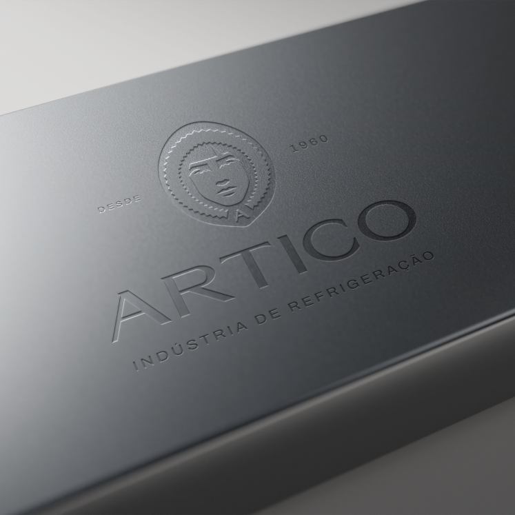
ARTICO needed to communicate robustness and longevity, not just aesthetics.
We introduced finish and texture directions to reinforce quality and sophistication.
03 / 06
Real differentiation in the market
ARTICO needed to stand out in a sector full of very similar visual codes and messages.
We mapped parity vs. differentiation and defined a territory of its own that makes it recognizable and unique.
04 / 06
A strategic foundation to decide and grow
ARTICO needed a single north star to guide product, communication and priorities.
We consolidated purpose, values, vision, segmentation and positioning, creating practical clarity for decisions.
05 / 06
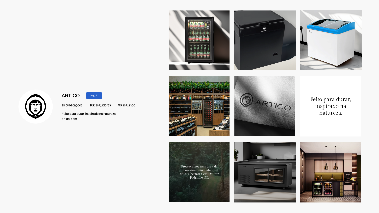
Winning over the end consumer
ARTICO wanted a real presence in the end-consumer market without losing the authority it had built in the business market.
We defined segments and priorities to give communication and the offering a clear focus.
Keeping the Eskimo and the color blue
One of ARTICO's requests was to keep the Eskimo and the color blue, part of the brand since the very beginning, more than 60 years ago.
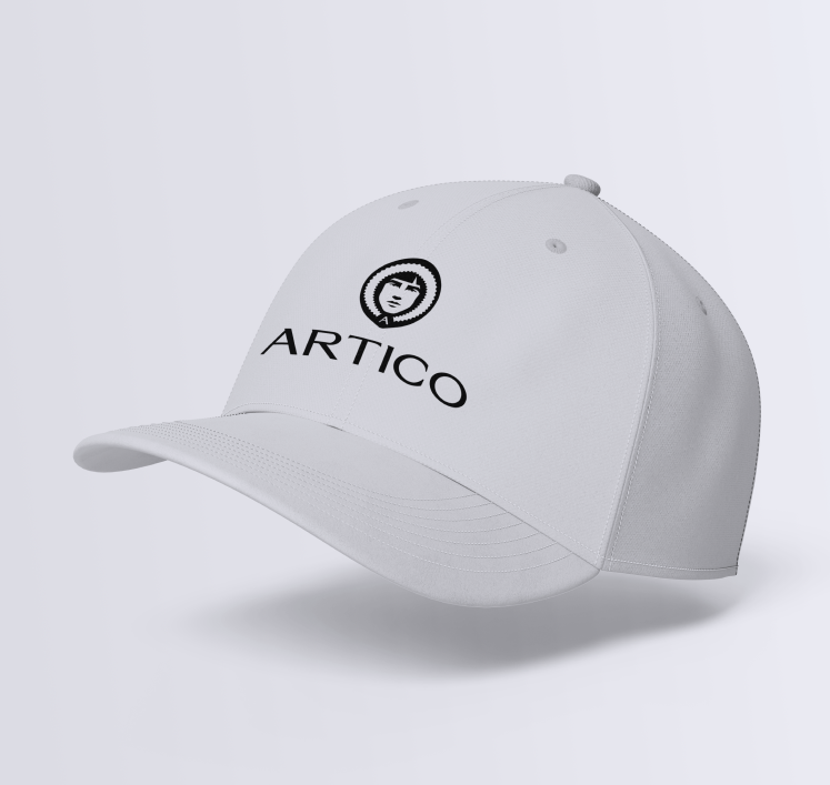
We kept these iconic elements and updated them to align with the desired image of the new brand.
Simplicity and restraint
ARTICO needed sophistication without visual noise.
We set minimalism, negative space and restrained color as identity rules.
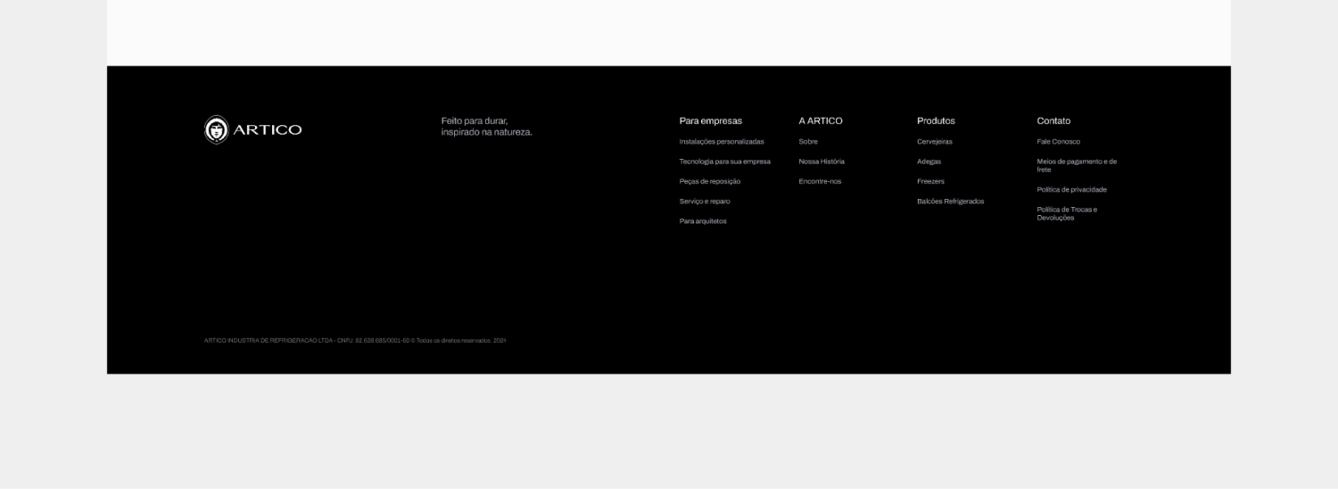
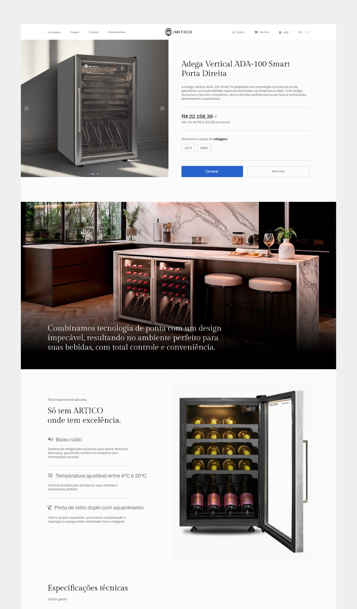
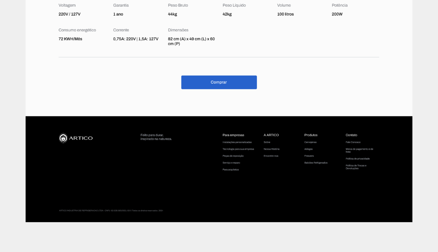
Premium palette
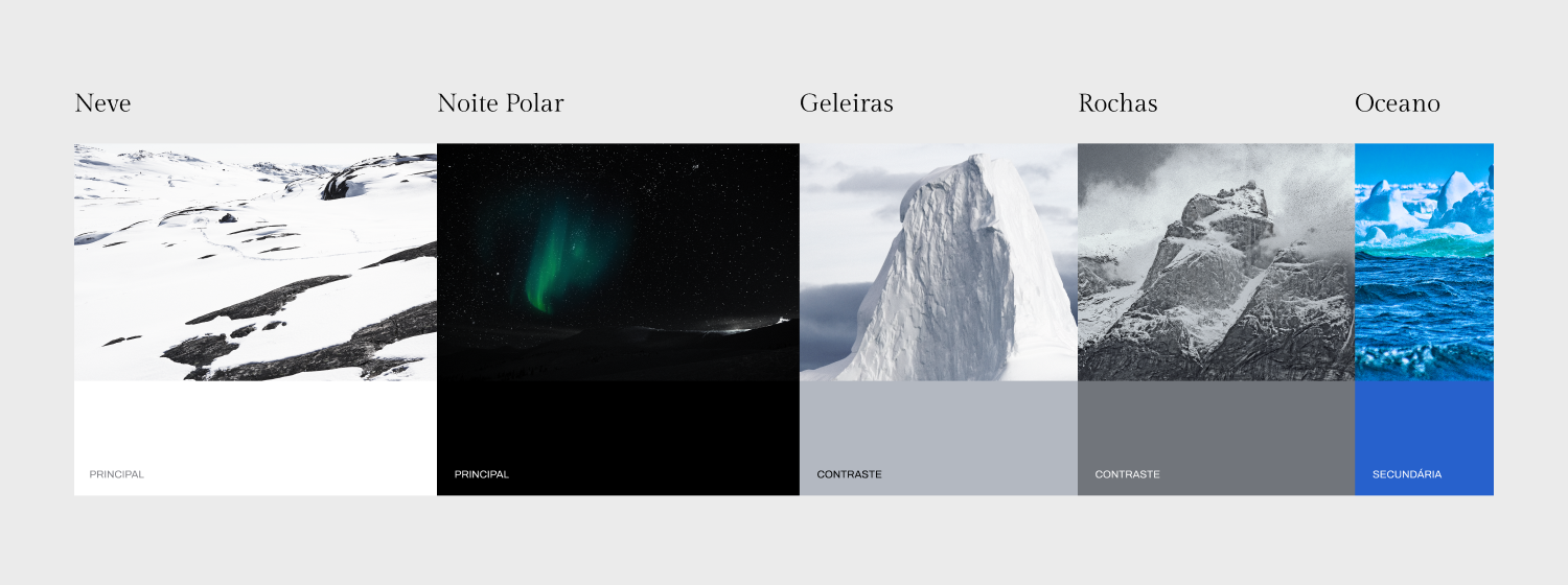
Blue alone couldn't carry a sense of exclusivity and authority.
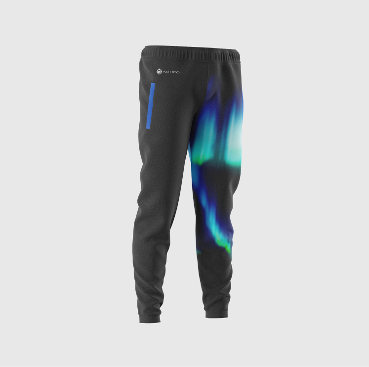
We restructured the palette around black/white and cool grays, using blue as an accent.
06 / 06
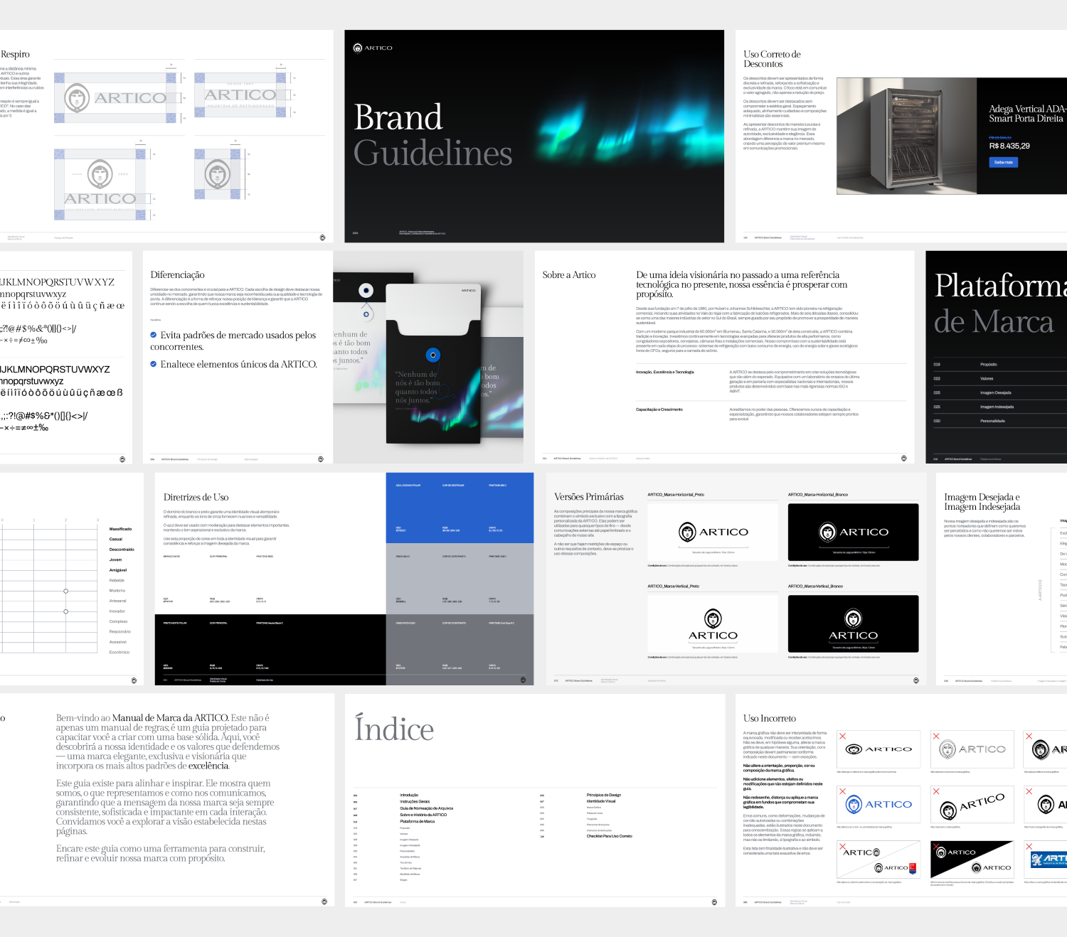
A system ready to scale
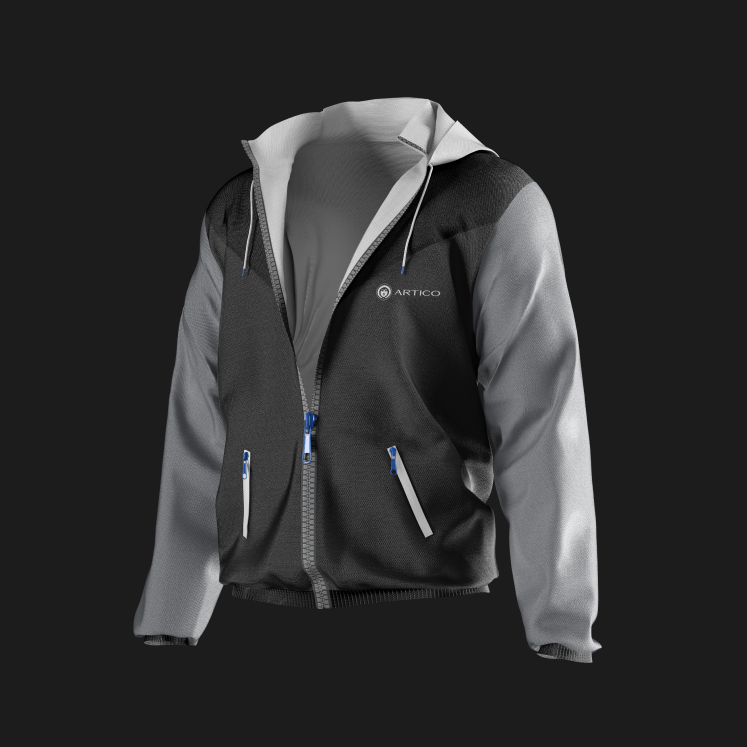
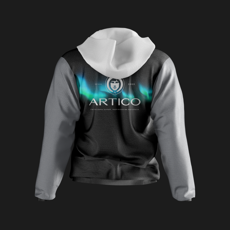
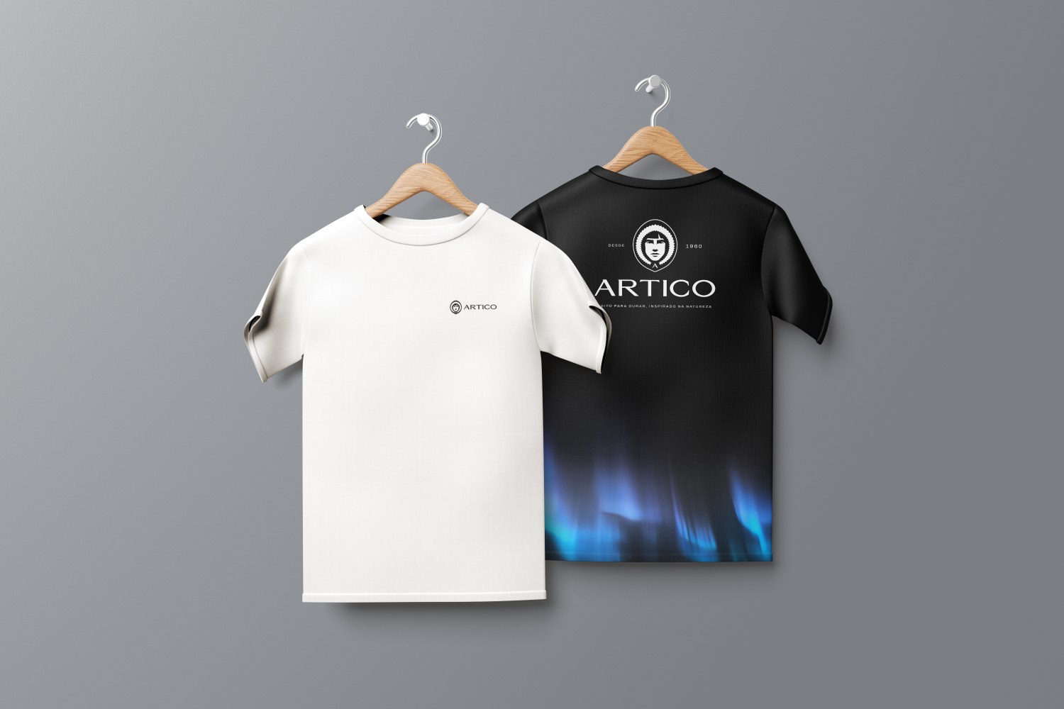
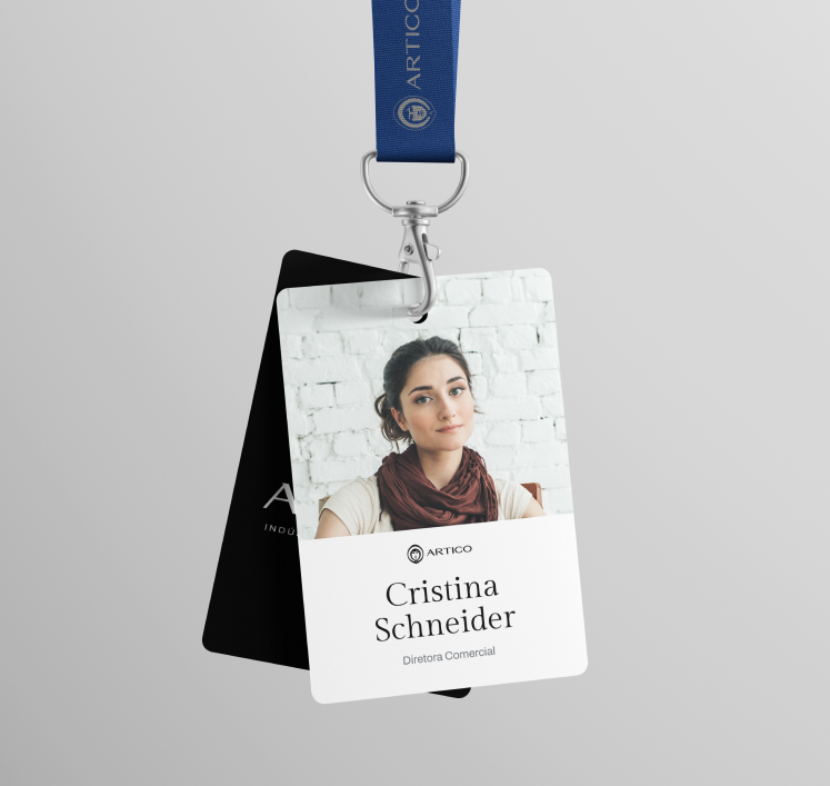
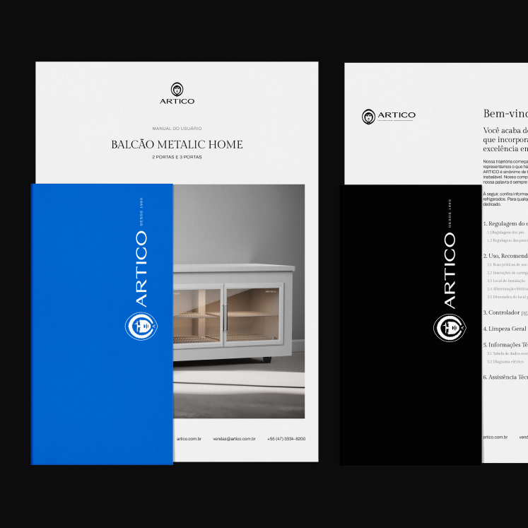
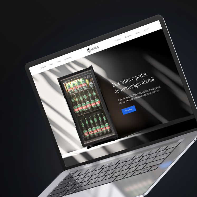
ARTICO needed consistency across every touchpoint, not just a new logo.
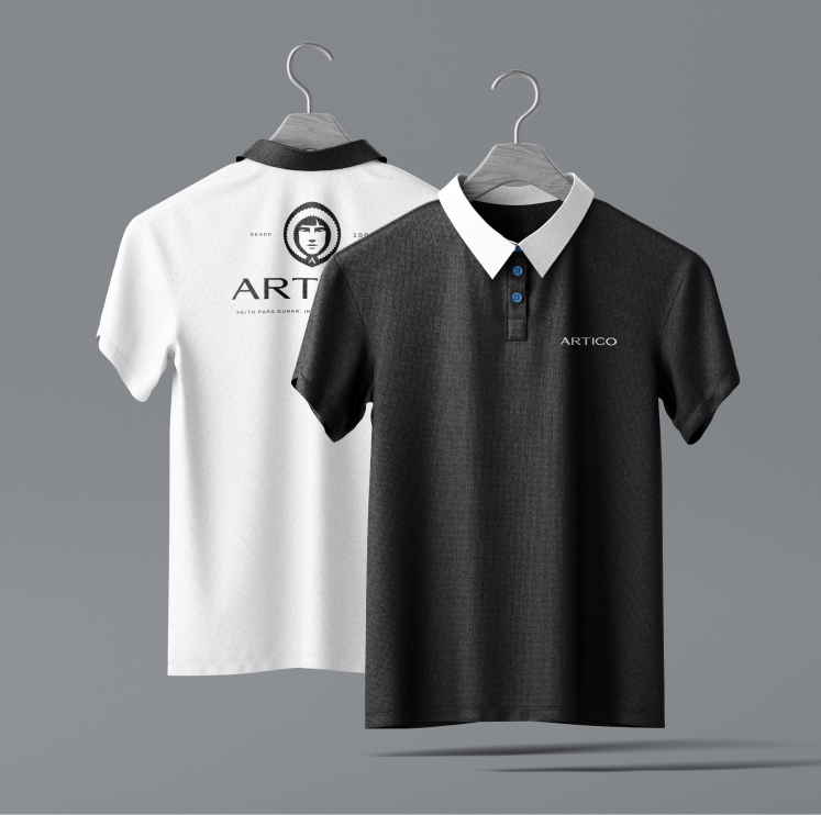
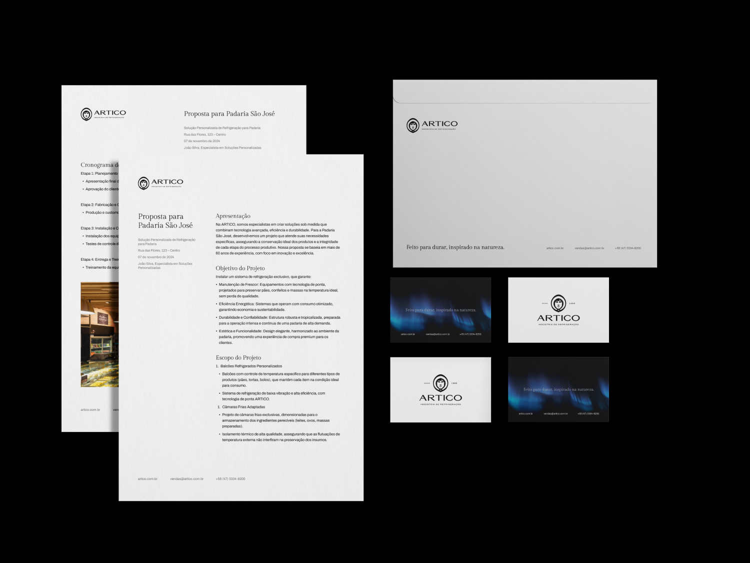
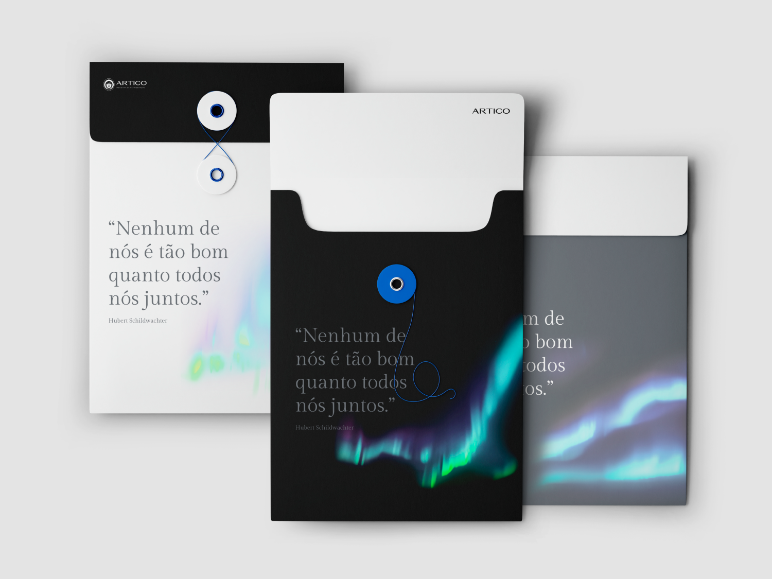
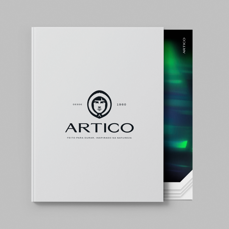
We delivered a communication strategy, an implementation plan and a complete brand book for continuous, coherent application.
Recognition guaranteed
The brand couldn't lose the recognition it had built over decades.
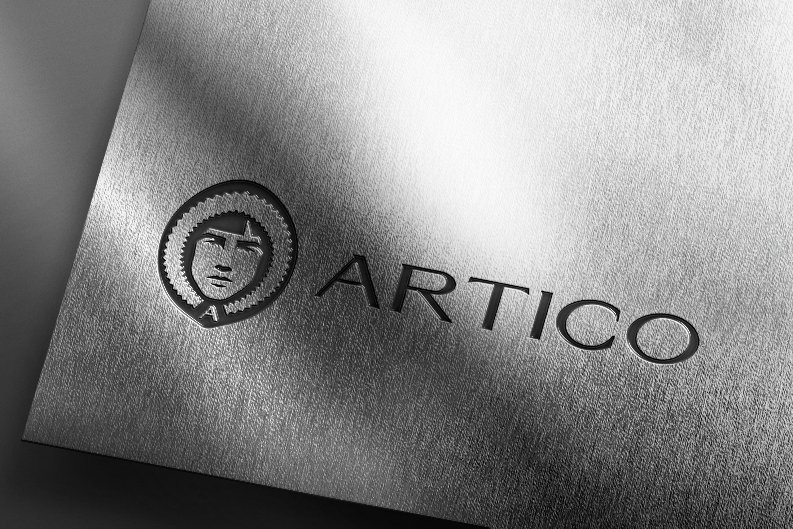
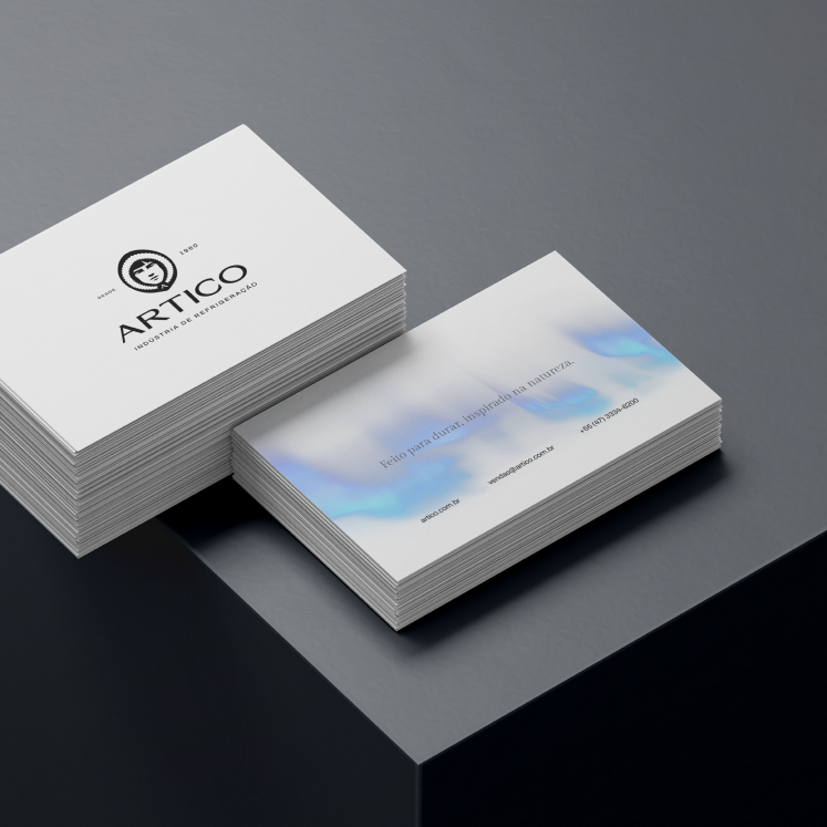
We kept key elements such as the Eskimo's parted bangs and added the “A” on the hood as an anchor.
Typography with heritage and sophistication
The brand needed a more upscale, mature tone without looking dated.
We created a refined typeface with moderate serifs and German inspiration, balancing tradition and modernity.