0607
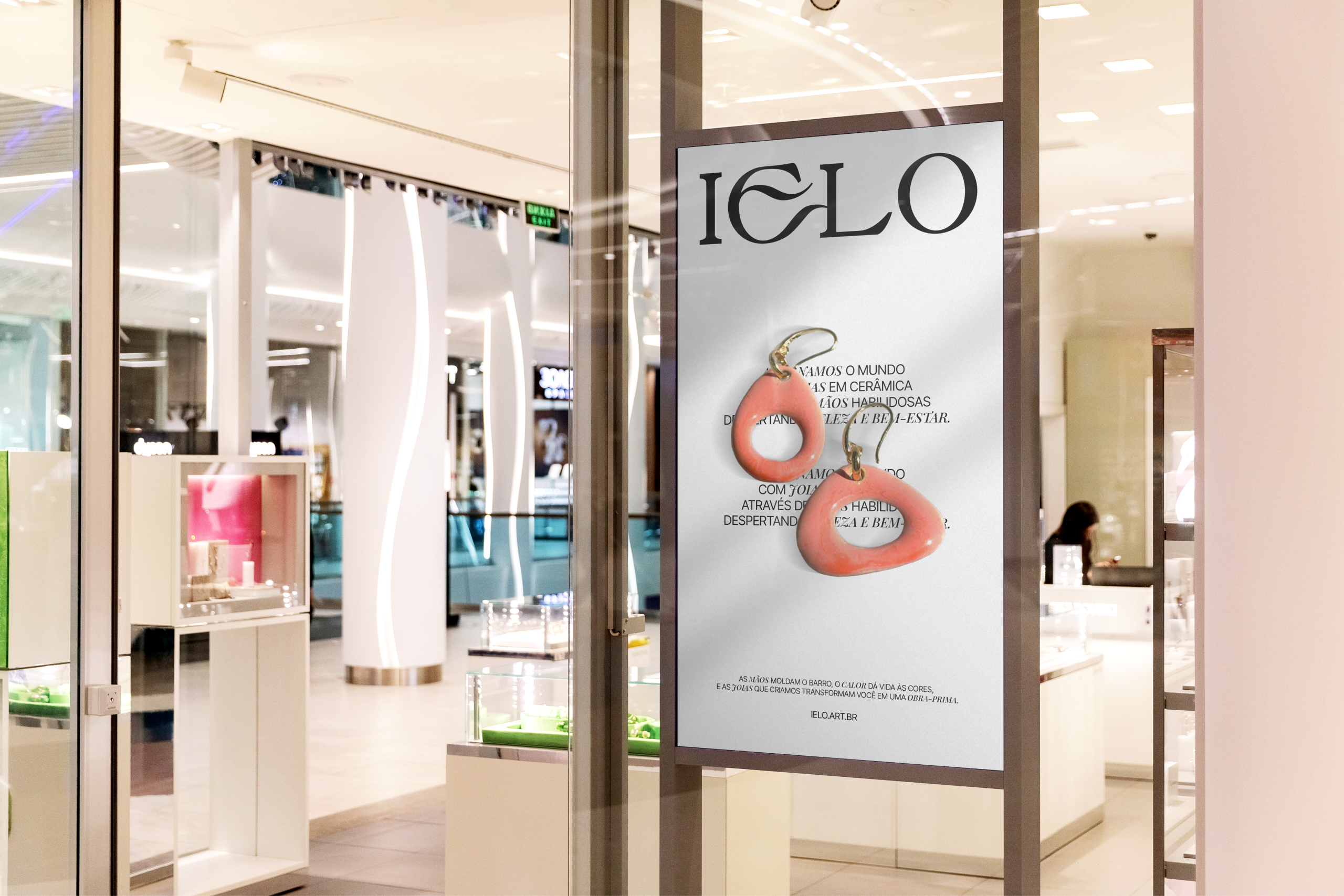
IELO , Ceramic Jewelry
Project
Where sophistication and
craftsmanship meet
- SERVICES
- Brand strategy
Brand design - CLIENT
- IELO
- SECTOR
- Ceramic Jewelry

The client
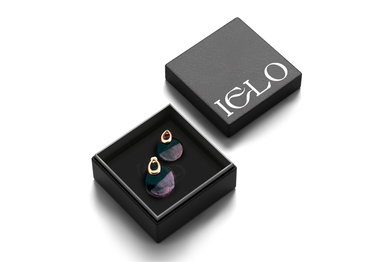
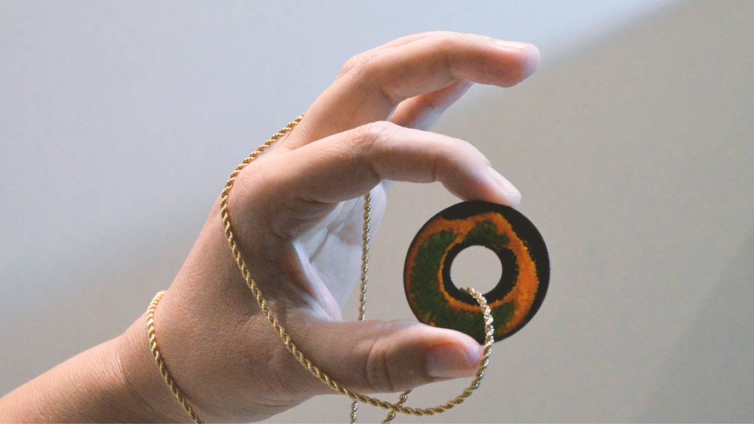
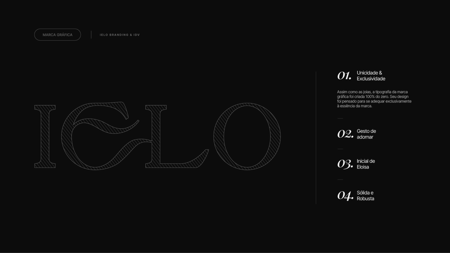
IELO is a brand of signature ceramic jewelry created by Eloisa Sielski, who turns a lifelong bond with handmade work into exclusive pieces. It's work in which each piece is born from the contrast between cold & hot, past & present, handcrafted & sophisticated.
The challenge
Eloisa was just starting her business and needed the brand to do two things at once: tell the true story of a real maker with skilled hands who had been making small crafts since childhood, and command a sophisticated image that stood apart from the competition.
What we solved · 01 / 05
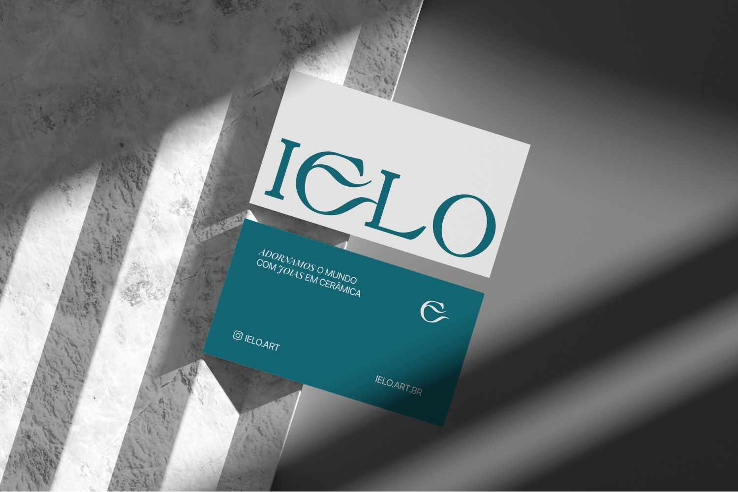
A true narrative
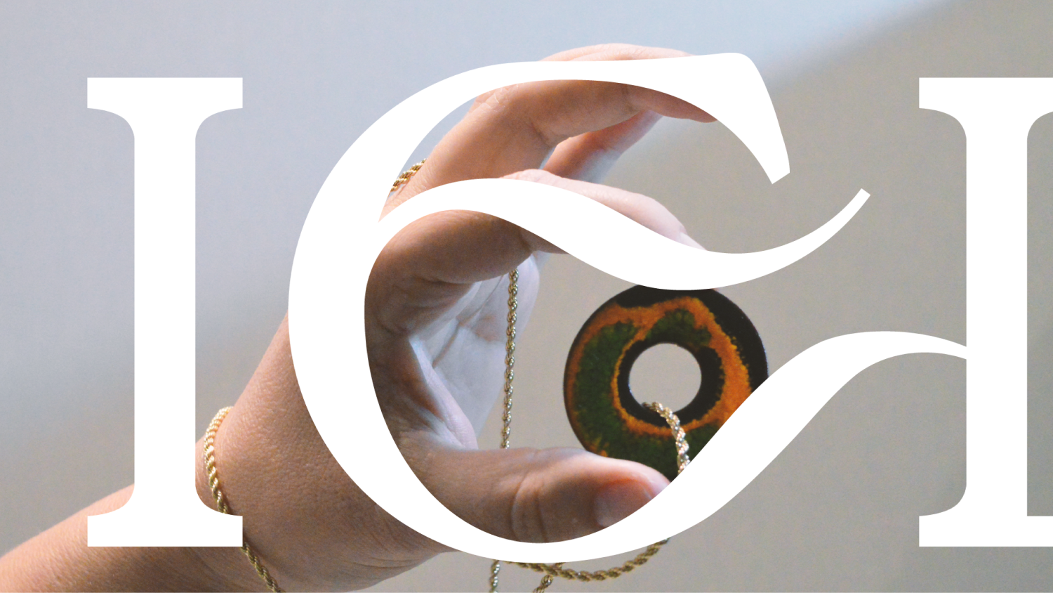
The story of Eloisa and her childhood nickname “IELO” was powerful, but it had to be told with maturity so it wouldn't turn overly romantic.
We treated the origin and the craft as roots, and IELO gained a serious narrative, with the past as its truth.
02 / 05
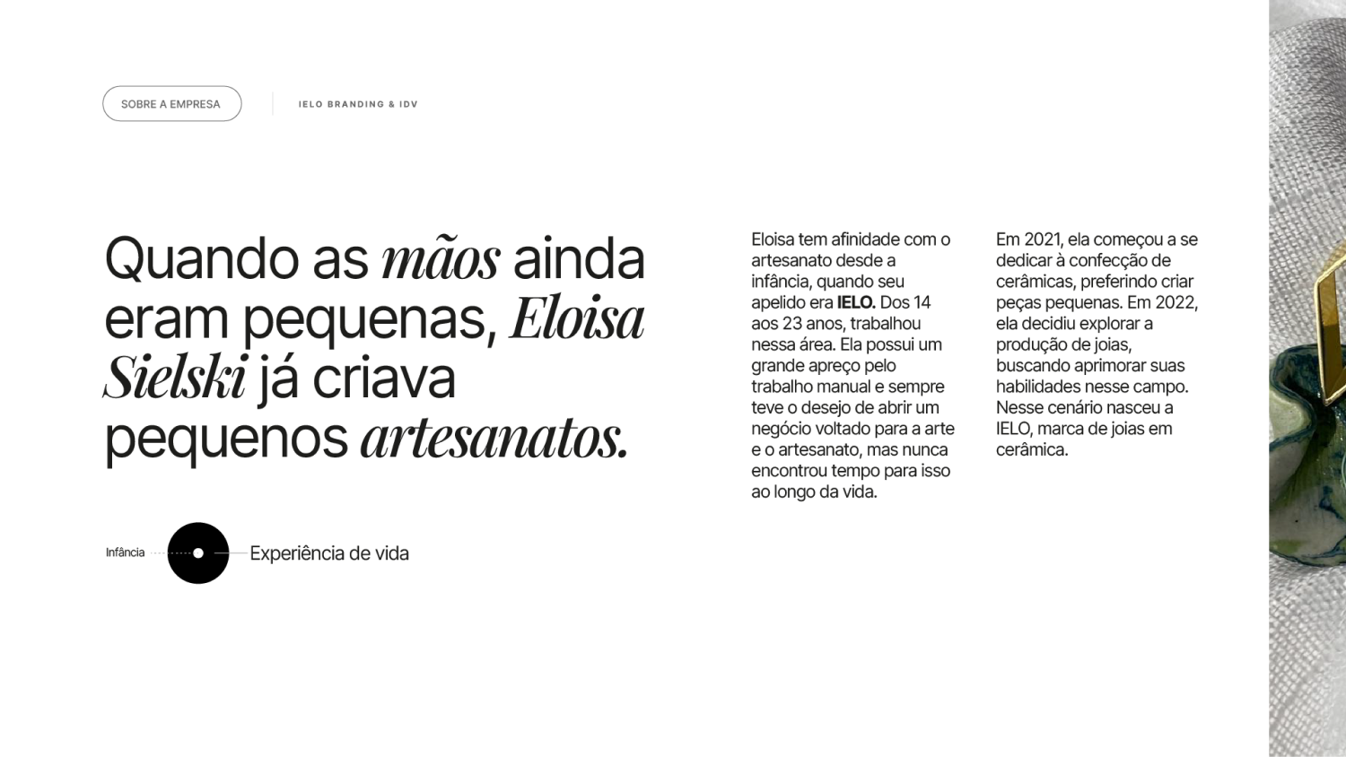
Strategy that becomes a decision filter
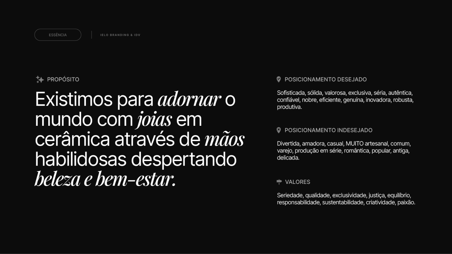
IELO needed to be born with a clear foundation so it wouldn't rely solely on the beauty of its pieces to look sophisticated and different.
That's why we structured the brand strategy with purpose and desired and undesired images.
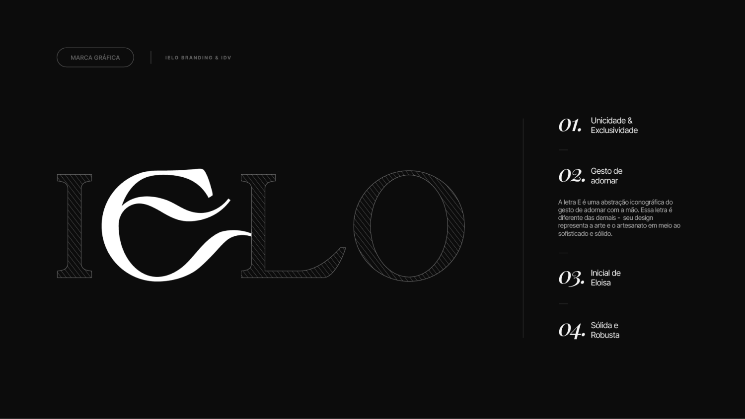
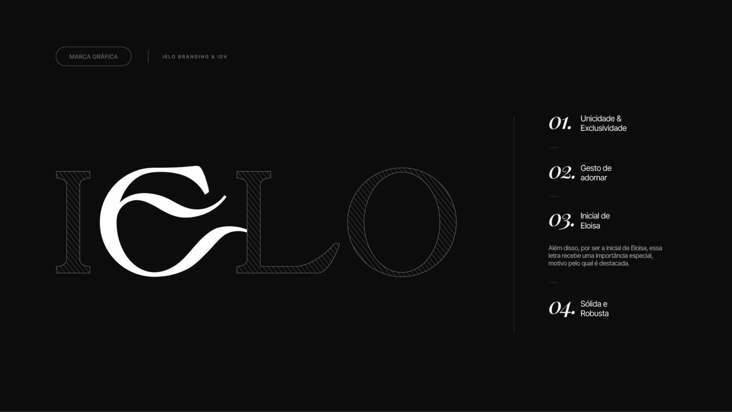
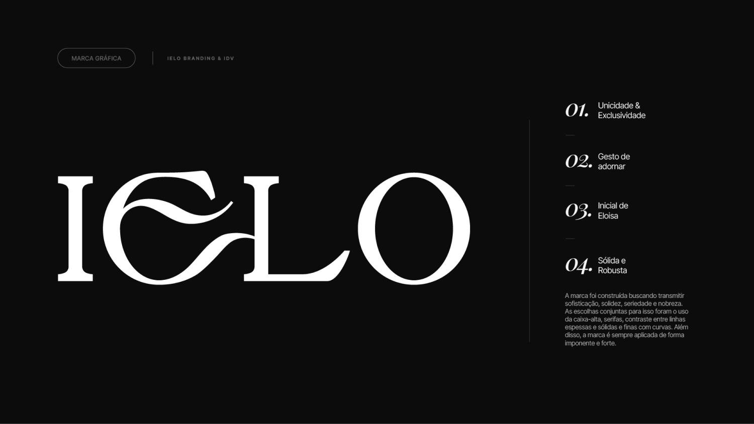
03 / 05
Differentiation against the overly crafty
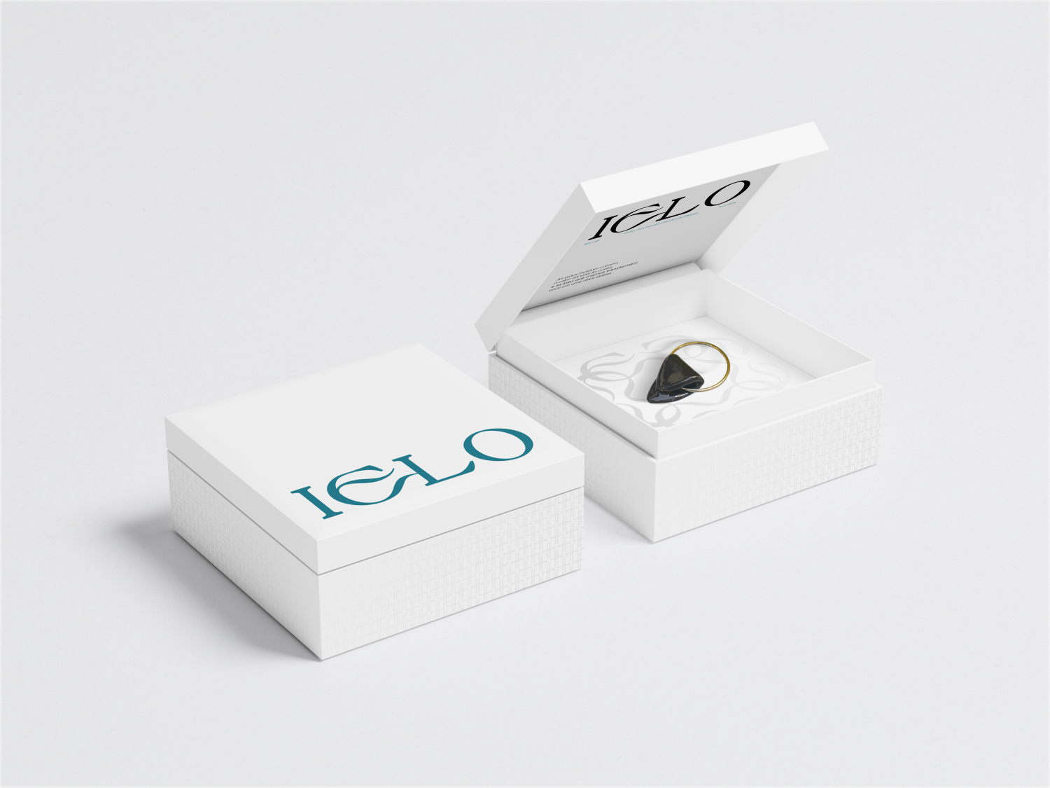
In the market, ceramics often falls into the territory of unsophisticated crafts, and IELO needed to claim the place of exclusive jewelry.
We defined what the brand would not be and designed a system that pulls toward value, shifting the perception from handmade to masterfully made.
04 / 05
Visual consistency
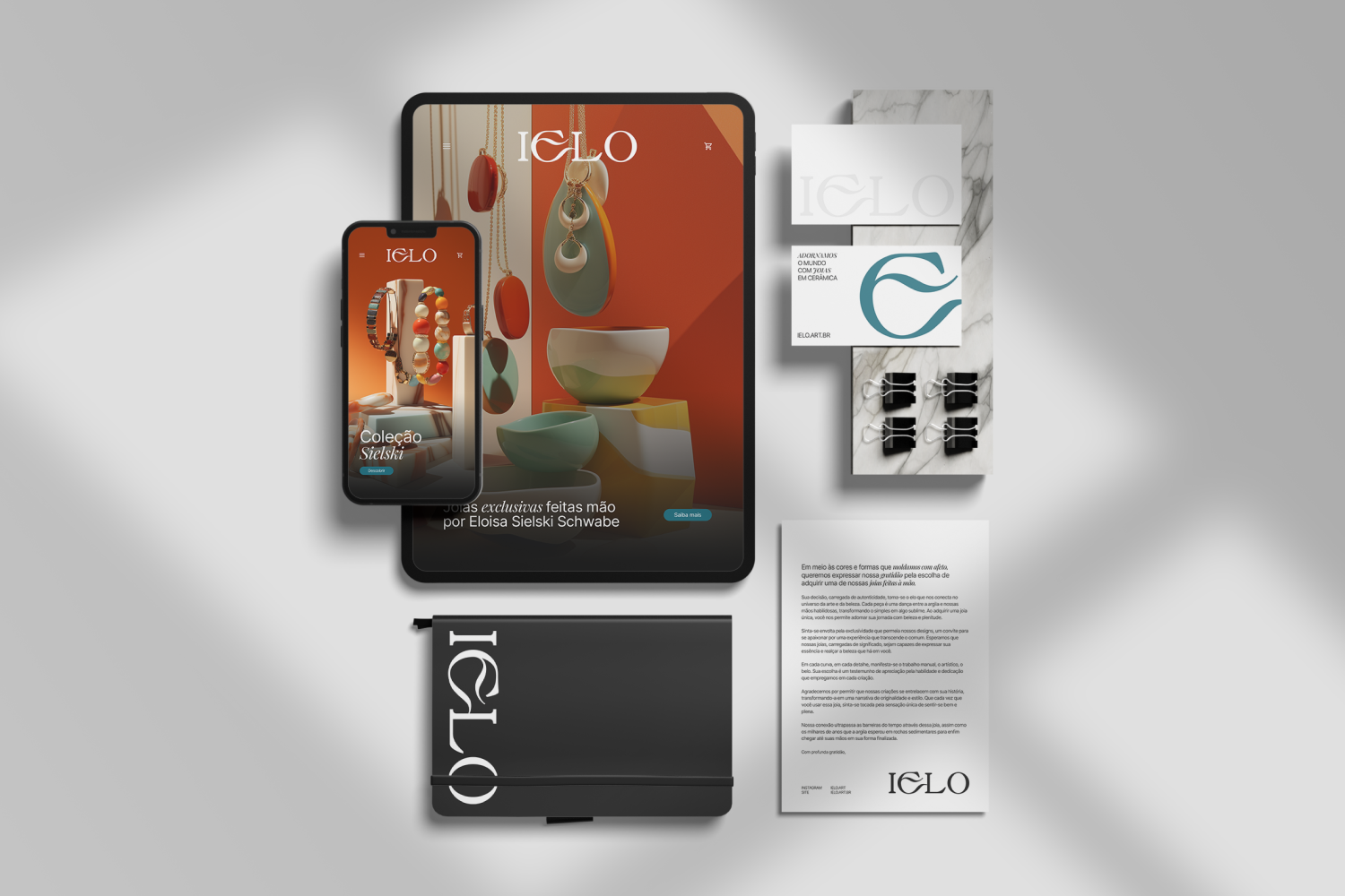
As a new brand, IELO needed to look established from the very first contact, with coherent, elevated photos and posts.
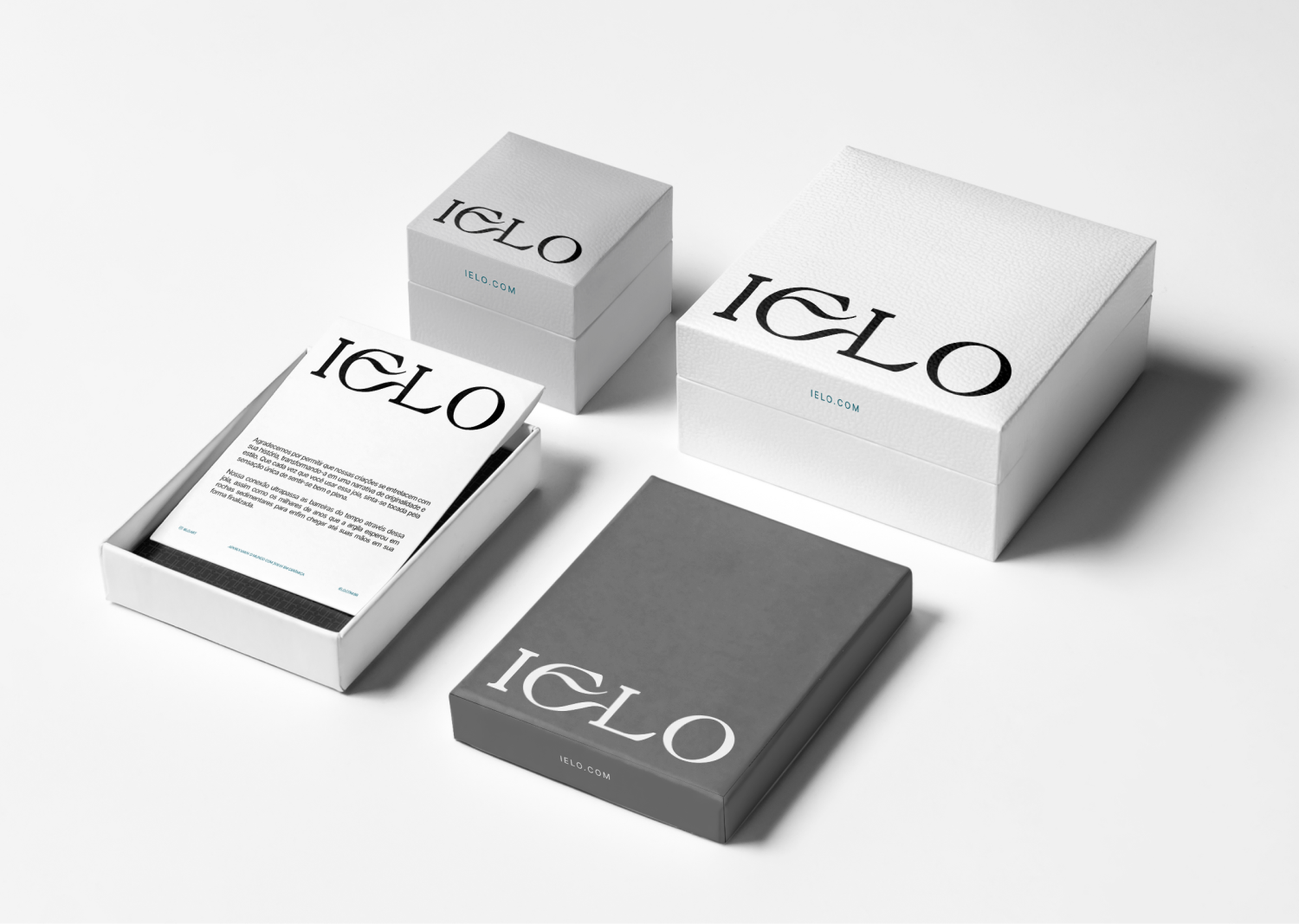
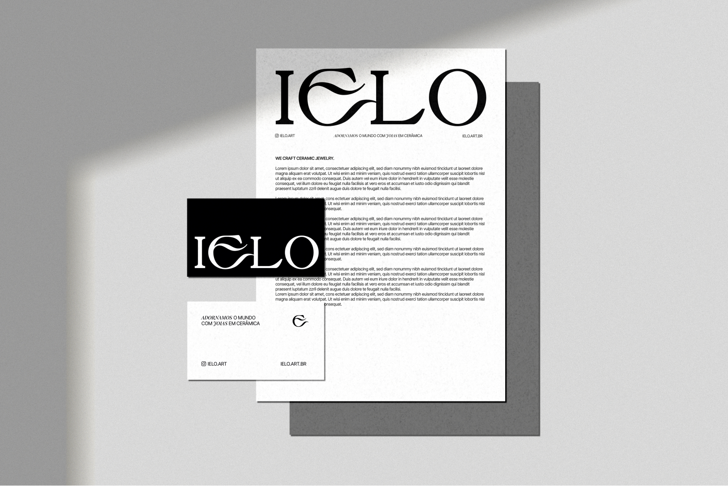
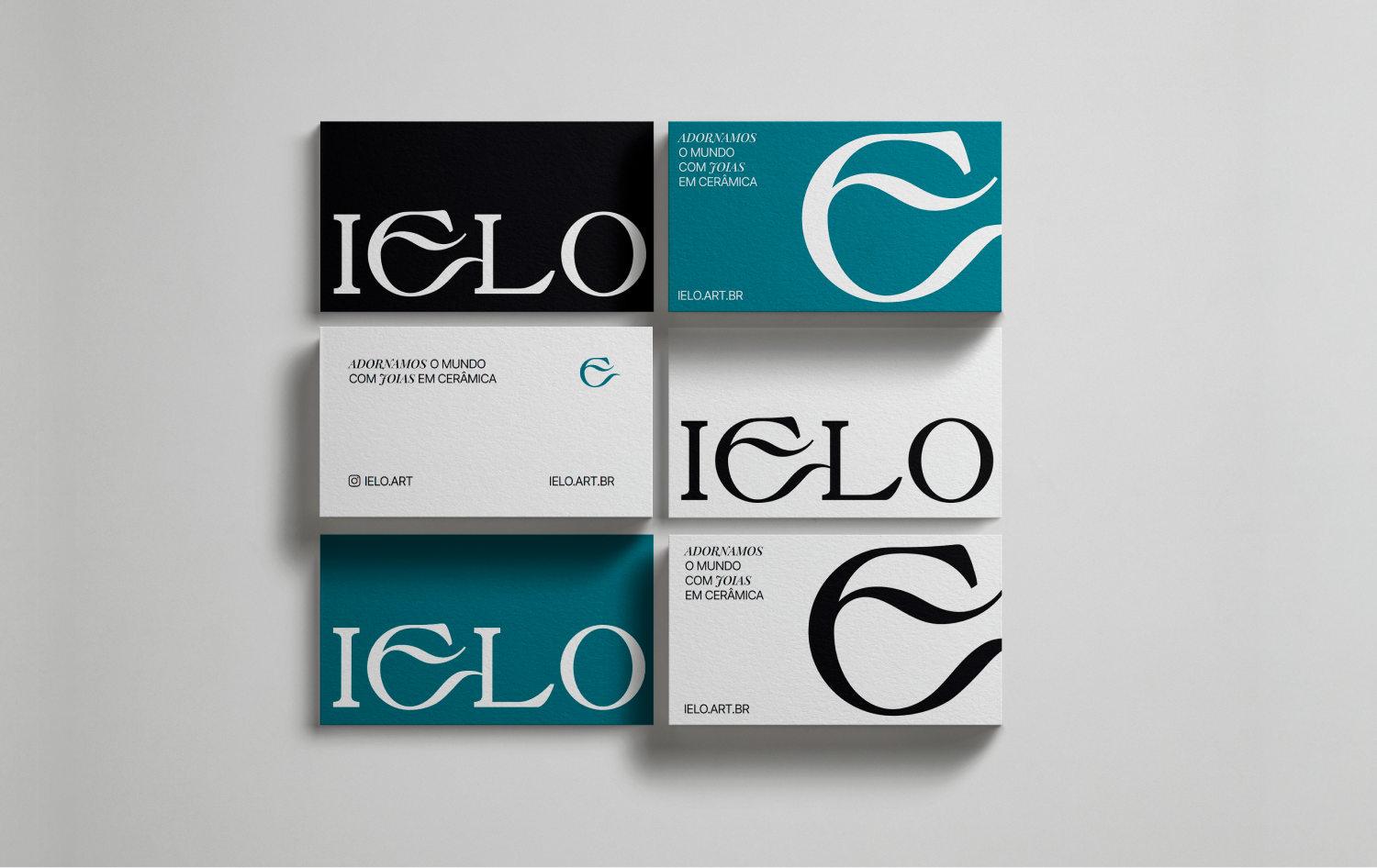
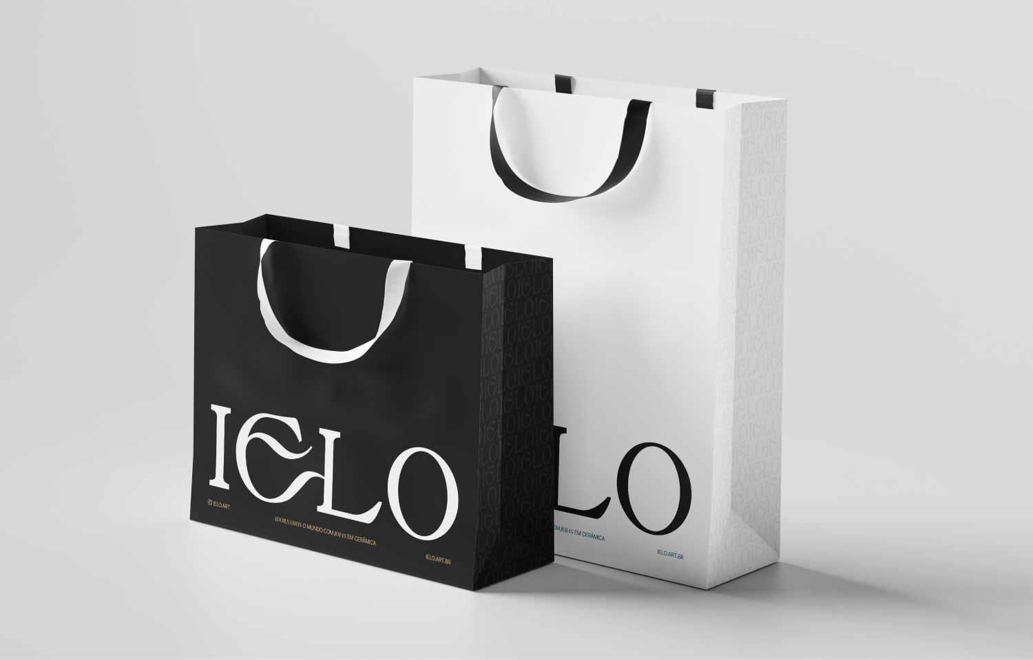
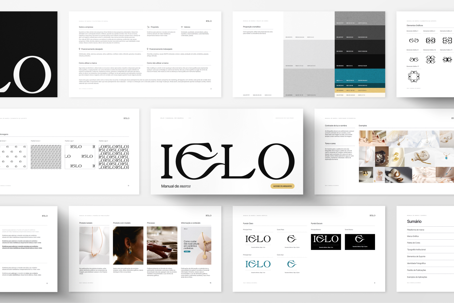
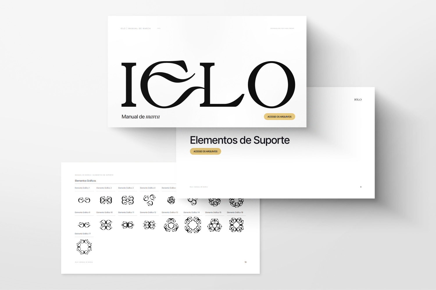
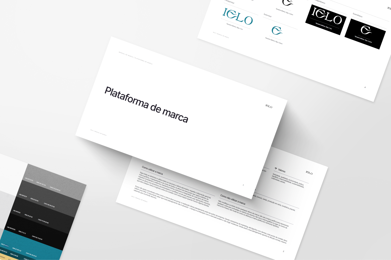
We created the brand design, brand book, photographic identity guidelines and a post standard to repeat codes of sophistication, with image guidelines that highlight material and finish and a language that attracts people who buy for value.
05 / 05
Contrast as the core concept
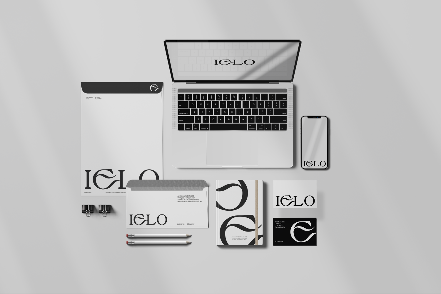
The essence of the business lives in its dichotomies: cold & hot in the process, past & present in the maker, handcrafted & sophisticated in the result, and this had to come through without long explanations.
We used black and white as the axis and a language of contrast, and the brand began to communicate depth.